ADA-Minded Digital Menu Design for U.S. Restaurants
ADA-minded digital menu design for U.S. restaurants starts with one practical goal: help more guests browse, understand, and order with less friction. Whether you run a neighborhood cafe, a fast-casual salad shop, a sports bar, a food truck, or a multi-location burger brand, your digital menu should work for guests using screen readers, larger text, keyboard navigation, and their own phones in different lighting and noise conditions. Accessibility is not just a compliance discussion. It is an operations decision that affects ordering speed, guest confidence, staff interruptions, and check averages. Because accessibility expectations can vary by context and location, operators should confirm current requirements with qualified advisors and official guidance.
Start with access, not just appearance
Many operators build a digital menu around visual style first: big food photos, branded colors, animated category tiles, and a QR code on the table. But ADA-minded access begins with whether a guest can actually use the menu without assistance. In a U.S. dining room, that means thinking beyond the average smartphone user.
For example, a casual diner in Ohio may place QR table tents on every booth. If the menu opens as a PDF with tiny text, a guest with low vision may struggle to zoom, scroll, and return to categories. A better workflow is a mobile-friendly web menu with real text, clear headings, strong contrast, and large tap targets. In a Texas food truck, a guest ordering in bright sun may need high contrast and simple buttons more than artistic graphics. In a hotel restaurant, a traveler with a screen reader may need menu sections that are labeled clearly instead of image-only buttons.
At a minimum, operators should review whether guests can do these tasks easily:
- Open the menu without downloading an app
- Read item names, prices, and modifiers in plain text
- Navigate categories in a logical order
- Understand allergens, spice levels, and add-ons
- Complete ordering or request staff help without confusion
If your digital menu breaks at any of those points, staff usually absorb the problem. Servers spend more time explaining modifiers tableside, cashiers re-enter takeout details at the counter, and bar staff answer repetitive questions during a rush. Better access often improves labor efficiency as much as guest experience.
Build a readable menu structure for real restaurant use
A digital menu should be easy to scan in the same way a well-designed printed menu is, but with the added benefit of better navigation. The structure matters more than flashy design.
Use plain category labels
Choose labels guests already expect: breakfast, sandwiches, kids menu, beer, desserts, sides. A brunch restaurant in Atlanta should not hide omelets under a creative heading that makes sense only to the marketing team. Clear labels help every guest, including those using assistive technology.
Write item descriptions that answer ordering questions
Short descriptions reduce staff back-and-forth. A Chicago fast-casual bowl concept might list a chicken bowl with rice, black beans, pico, and chipotle crema, then provide simple modifier choices for protein, heat level, and extras. Avoid vague descriptions that force guests to ask what is included. If your operation serves items with common allergens or major ingredient swaps, present that information consistently and verify how it is maintained in your POS and online ordering systems.
Keep pricing and charges clear
Guests should understand what they are ordering and what they are paying before checkout. If your digital ordering flow includes optional tips, service charges, delivery fees, or packaging fees, present them clearly and distinctly. In the U.S., service charges and tips are not the same thing operationally, and tax treatment may differ. Operators should confirm setup and guest-facing wording with their POS provider, accountant, payroll team, and official state or local guidance.
For chains that fall under federal menu labeling rules, digital menu workflows should also be reviewed carefully so required information appears where appropriate. If you operate in that category, verify current FDA guidance and implementation details with qualified advisors.
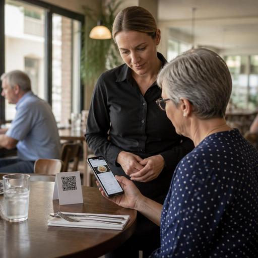
Make QR menus work for more guests at the table and on the go
QR ordering can be convenient, but only if it does not become the only practical path. An ADA-minded approach gives guests options. A full-service restaurant in Seattle might offer QR access for browsing and reordering drinks, while still keeping printed menus available on request and training servers to guide guests without making the interaction awkward.
Consider these common U.S. scenarios:
- Fast-casual counter: A guest scans a code while waiting in line. The menu should load quickly, show popular categories first, and avoid clutter that slows ordering.
- Sports bar: Low light and glare can make screens harder to read. Use strong contrast, larger buttons, and concise category names.
- Airport concession: Travelers may be carrying bags, using one hand, and rushing to a gate. Keep the ordering path short and the pickup instructions obvious.
- Food truck: Cellular service may be inconsistent. A lightweight menu page is often more reliable than a heavy visual layout.
- Curbside pickup operation: Guests need easy access to arrival instructions, vehicle details, and a simple way to alert staff.
Placement matters too. A QR code stuck under a condiment caddy or printed on a reflective table tent creates friction before the guest even sees the menu. Put codes where they are easy to find, easy to scan, and supported by a short verbal prompt from staff when needed. If a guest cannot or does not want to use a phone, your team should have a clear backup process.
Connect accessibility to POS, KDS, and team workflows
Digital menu access is not just a front-end design project. It affects the entire order path from guest input to kitchen production to payment. If menu names are shortened awkwardly in the POS, if modifiers do not map cleanly to the kitchen display system, or if pickup names are hard to verify, accessibility gains can disappear once the order reaches operations.
A practical setup for U.S. operators includes:
- Consistent menu data: Keep item names, descriptions, and modifier groups aligned across QR menus, direct online ordering, delivery apps, and the POS.
- Readable kitchen routing: Make sure customizations entered by guests appear clearly on the KDS so expo and line cooks do not guess.
- Simple payment flow: Avoid confusing checkout screens, especially where guests choose between takeout, curbside pickup, or dine-in tabs.
- Staff fallback training: Teach hosts, servers, and cashiers how to help a guest complete an order without embarrassment or delay.
For example, a multi-location taco brand may standardize modifier language so every store uses the same labels for tortillas, salsa heat, and add-ons. That helps guests order consistently and reduces remakes. A hotel restaurant can route room-service and dine-in orders differently while keeping the same accessible menu structure. A stadium venue may need a stripped-down mobile menu with only the highest-volume items and pickup shelf instructions to keep lines moving.
Audit your digital menu like an operator, not just a designer
The best accessibility improvements usually come from regular operational review. Test your menu during lunch rush, on an older phone, with bright sunlight, weak Wi-Fi, and one hand free. Ask a manager to complete an order using only keyboard navigation on a desktop version if you offer web ordering. Have staff check whether item descriptions answer common guest questions. Review whether pickup shelf labels, order-ready notifications, and curbside arrival flows are easy to understand.
A useful monthly audit can include:
- Broken links or QR codes
- Low-contrast text or image-heavy category buttons
- Modifier groups that are hard to understand
- Missing allergen or ingredient notes where your concept relies on them
- Checkout steps that create abandoned orders
- Inconsistent menu data across direct ordering and delivery marketplaces
Also listen to guest feedback from the floor. If servers at a Florida seafood restaurant keep hearing that the oyster options are hard to compare on mobile, that is a design problem. If a pickup-heavy sandwich shop in Denver sees guests walk past the pickup shelf because the final instructions are unclear, that is also a menu workflow issue.
An ADA-minded digital menu is really a hospitality tool. It helps more guests order independently, supports clearer communication, and reduces friction across dine-in, takeout, and direct online ordering. With the right structure, readable design, and connected POS workflow, operators can make accessibility part of day-to-day service rather than an afterthought. Restomas can support that effort by helping restaurants organize digital menus, ordering flows, and operational handoffs in one system.