How Does QR Menu Color Choice Affect Sales? A Guide for Restaurants
QR menu color psychology is not merely an aesthetic preference in digital menu design; it is an experience element that directly affects how customers navigate the menu, which products they pay attention to, and how quickly they make an ordering decision. In restaurants, a well-designed QR menu presents products more clearly, reduces decision fatigue, and makes high-margin items more visible. That is why color choice should be approached less through the question "which shade looks nicer?" and more through the question "which shade triggers which behavior?"
Why is color psychology so critical in a QR menu?
With a printed menu, the customer looks at a single surface; with a QR menu, screen brightness, device size, scrolling behavior, and attention span all come into play. This digital context makes color use even more important, because on a screen, color is the fastest way to distinguish headings, prices, promotion labels, category transitions, and call-to-action areas.
For example, warm tones such as red and orange can evoke movement, speed, and appetite. That is why they can take on an attention-grabbing role for fast-moving products, daily deals, or limited-time offers. Green tones, by contrast, convey a sense of freshness, naturalness, and lightness; they may be more suitable for salads, vegan options, smoothies, or seasonal products. Tones such as black, dark gray, and burgundy can support a premium perception; they can be effective in steak, specialty coffee, craft drink, or chef's-recommendation categories.
There is an important point here, however: the effect of colors does not work in isolation. Color takes on meaning together with the product name, description, photo, pricing, and category order. In other words, a product won't automatically sell more just because you used red; but red used in the right place can move the customer's attention to that product more quickly.
Which color is more suitable for which menu purpose?
The most common mistake restaurant owners make is painting the entire menu in the brand color. Yet in a QR menu, the aim is not only to reflect corporate identity but also to ease the decision flow. That is why it is healthier to think of colors as "background color," "accent color," and "category color."
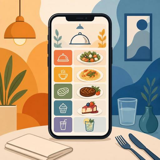
- Red: suitable for grabbing attention, creating a promotion area, and highlighting limited-time offers.
- Orange: gives an energetic, warm feeling; can be used for snacks, takeaway-focused products, and quick-decision areas.
- Green: creates a perception of freshness, lightness, and natural content; effective for salad, vegan, fitness-friendly, or seasonal options.
- Yellow: when used in small doses, it provides noticeability; it can work for warnings, new-product labels, or upsell suggestions.
- Black and dark tones: create a premium, strong, and exclusive perception; valuable in fine dining or upper-segment presentations.
- Blue: conveys a sense of trust and order; however, since its appetite association is weak, it should be used carefully as a main accent color.
The main idea here is that no single color is "the color that sells the most." The best result emerges when product type and color association match. A burger brand and a third-wave coffee shop should not be expected to use the same color strategy.
Sales-boosting color use starts with contrast and hierarchy
In QR menu design, the element that actually affects sales is often not the color itself, but contrast and visual hierarchy. What does the customer see first on the screen? The category, the product photo, the price, or the "most popular" label? The answer to this question determines how well the menu works.
Let's consider a concrete example: if a cafe serving breakfast makes all its category headings light gray, the customer can get lost within the menu. If that same cafe uses dark green for category headings, warm orange for the product labels it wants to highlight, and off-white in the background, the menu is scanned more comfortably. That way the user understands the difference between "spread breakfast," "extras," and "drinks" more quickly.
Similarly, displaying prices in an overly dominant color can sometimes backfire. Especially in premium restaurants, when the product name and description are in the foreground and the price is in a calmer tone, the perception of quality can be preserved. In quick-service businesses, on the other hand, price visibility can be more critical. In other words, the color strategy should change according to the business's service model.
A practical rule for a good QR menu color hierarchy
- Choose one main brand color.
- Define one accent color.
- Use neutral background and text tones.
- Highlight promotion, best-seller, or new-product labels using the accent color only.
- Don't use too many bright colors together on the same screen.
This structure makes the menu both aesthetic and functional.
Color scenarios for different restaurant concepts
The best way to understand color psychology is to think about it on a concept-by-concept basis, because every restaurant has a different sales goal, product structure, and customer expectation.
Burger and fast-casual businesses
Here, appetite, speed, and ease of decision come to the fore. Warm red or orange accent areas on a dark background can create an energetic flow within the menu. Areas like "build a meal," "add an extra," or "most popular" can be supported with warm tones.
Coffee shops and boutique cafes
Colors like earth tones, cream, dark brown, and sage green can create a more inviting atmosphere. Limited but distinct accent colors should be used especially for desserts, single-origin coffees, or seasonal drinks. Overly bright colors can weaken the boutique perception.
Health-focused menus
Tones of green, light beige, white, and soft yellow offer a clean, light look. What matters here is not turning the "healthy" feel into a clinical, cold design. In other words, the aim should be a natural look, not a sterile one.
Fine dining and premium restaurants
Dark backgrounds and warm tones evoking copper, burgundy, cream, or gold can strengthen the premium perception. But readability must not be sacrificed. Using low-contrast text for the sake of looking elegant ruins the customer experience.
Is it possible to test color decisions in a QR menu with data?
Yes, and this is one of the digital menu's strongest advantages over the printed menu. Whereas changing a color decision on a printed menu creates time and cost, in a digital menu category highlights, product labels, or promotion areas can be managed more flexibly. This gives businesses the opportunity to test and learn.
For example, if you are highlighting a certain product group with a "chef's recommendation" label, you can change the color of that area and observe customer behavior. Likewise, the accent tones used for seasonal drinks, desserts, or upsell suggestions can be updated periodically. The aim here is not to change colors at random; it is to improve menu flow, category visibility, and product discovery.
When QR menu management is easy, the restaurant team can adjust the presentation more nimbly according to the season, a promotion, or the day's demand. This flexibility creates a direct link between menu management, product visibility, and operational speed. Especially for businesses with multiple locations, maintaining color and category consistency centrally is an important advantage as well.
6 actionable steps for restaurant owners
- First, define your sales goal: Do you want to sell more add-ons, highlight premium products, or shorten the decision time on the menu?
- Don't give every category the same visual weight: Highlight strategic product groups with color and contrast.
- Keep the background simple: Complex patterns and overly saturated backgrounds reduce product visibility.
- Run a mobile-screen test: Colors that look nice on desktop can be tiring on a phone.
- Check the harmony between photos and color: Backgrounds that clash with warm-toned food photos can weaken the appetite effect.
- Update the menu regularly: Rather than leaving color accents fixed for seasonal products, promotions, and best-sellers, optimize them as needed.
In conclusion, color psychology in QR menu design is not a magic formula; when applied correctly, it is a powerful tool that simplifies the order flow, manages attention distribution, and makes product priorities visible. The best color is not the brightest one; it is the color that most clearly serves your concept, your customer base, and your sales goal.
If you want to manage color, category, and product visibility in your QR menu in a more controlled way, Restomas's digital menu infrastructure can make this process more flexible.