Logo and Color Harmony in QR Code Design for Restaurants
Logo and color harmony in QR code design for restaurants is not merely an aesthetic matter; it is a critical touchpoint where customer experience, scannability, and brand perception meet at the same point. A QR code sitting on the table is often the guest's first connection with the menu, the order flow, and even the business's digital quality. For this reason, the code needs to resemble the brand just as much as it needs to work quickly and seamlessly. A well-designed QR code attracts attention, builds trust, and takes the user to the right action without requiring any extra explanation.
The fundamental balance in QR code design: visibility, trust, and scannability
Many businesses, when personalizing a QR code, swing to one of two extremes: they either use a completely black-and-white design that is disconnected from the brand but safe, or they produce over-visualized codes that look stylish but are hard to scan. Yet the right approach in a restaurant setting is to consider visual identity and technical readability together.
When a guest sits down at the table, they want to understand what to do within a few seconds. If the QR code is printed in very faint colors, reflects on a glossy surface, or the logo's size covers the center of the code more than necessary, the scan time lengthens. This creates a small friction before the order has even begun. Especially during busy service hours, these kinds of micro-hiccups can cause staff to give unnecessary support such as "bring your phone a little closer."
For this reason, design decisions should be tested with these three questions:
- Is it clear at first glance what it is?
- Does it scan quickly on different phone cameras?
- Is it consistent with the brand's tone?
For example, a modern third-wave coffee shop might prefer a more refined look with clean lines and earth tones. By contrast, a family restaurant can emphasize readability with a warmer, high-contrast design. In both cases, the purpose of the design stays the same: to carry the user seamlessly to the menu or order flow.
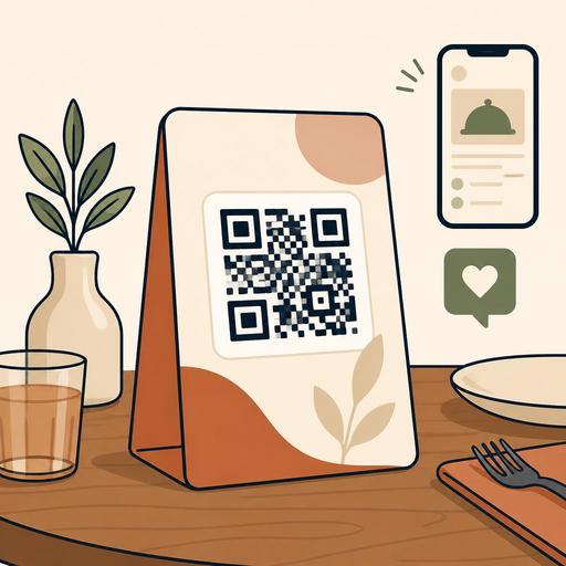
The mistake made when using a logo: thinking of the QR code like a poster
Adding a logo is a powerful method that makes the QR code feel like it belongs to the brand; however, the most common mistake here is pushing the code's function to the background in order to make the logo visible. The logo placed at the center of the QR code should be small and clean. The aim is not to enlarge the logo, but to create a sense of trust with a familiar brand mark.
Consider a concrete example: a burger-concept restaurant places its circular, thick-lined logo large, right in the middle of the QR code. This use, which looks stylish in print, can cause problems in low light or on older phone cameras. When the same logo is used smaller, with enough space left around it, both brand visibility is preserved and scan performance does not drop.
It is useful to follow these practical rules in logo placement:
- Use the logo at the center but in a limited size. Do not cover the code's data area more than necessary.
- Leave a clean area around the logo. Complex backgrounds or patterns make the central perception harder.
- Prefer a single-color or simplified version of the logo. Detailed emblems get lost especially in small prints.
- Test at every print size. A tabletop stand, an in-package card, and a window-entrance sticker may not give the same result.
There is one more point for restaurant chains: even if the logo stays the same, the usage scenario can change. The QR code on the table and the QR code on the takeaway bag can be prepared with the same design logic, but because of differences in light, surface, and distance, an identical application may not give the best result.
Color strategy: manage contrast, not the brand palette
The topic of color in QR code design is handled incorrectly in most businesses. The approach of "our main brand color is light beige, so let's make the QR code beige too" may look nice in print but can fall short in use. Because for a QR code to be readable, the real need is high contrast. The color choice should serve the brand identity; but it must not compromise on detectability by the camera.
The method that works well here is to use the brand palette in layers rather than loading it directly into the data area. For example:
- You can leave the code itself in a dark tone and use the brand color in the frame.
- You can keep the background simple and apply corporate colors in the call-to-action text area.
- You can create color variations for different use purposes, such as menu, payment, and reservation.
A fine-dining restaurant might use burgundy and gold tones strongly. But a gold-reflective print can strain the camera on the QR code. In this case, a dark anthracite code, a light cream background, and the use of a gold tone only on the frame or icon details is more balanced. A pizza brand, meanwhile, can use its energetic red in the CTA area or on the top header of the table stand and leave the code in a near-black tone.
What matters is not for the QR code to look "designed"; it is for it to work quickly in a way that is consistent with the business's overall visual language.
Is the same QR code approach right for the tabletop, takeaway, and storefront?
The short answer: no. QR code design must be considered according to the usage context. In a restaurant, there is a difference in distance, light, and intent between the code on the table and the code a passing customer sees in the window. For this reason, instead of using a single image everywhere, it is more efficient to design by scenario.
Tabletop use
Here the priority is fast access. The code must scan comfortably from a close distance and connect clearly to flows such as the menu, ordering, or calling a server. Complex backgrounds should be avoided.
Takeaway and delivery
The QR code on the package can be used for reordering, a campaign page, or a feedback form. But the surface may be curved or the printing low quality. For this reason, a thicker, simpler, and high-contrast version should be preferred.
Storefront and outdoor
Here visibility from a distance becomes important. The guiding area around the code, for example the purpose of viewing the menu or making a reservation, must be designed much more clearly. The print material should be chosen with glass reflection in mind.
This is exactly the point that creates value in restaurant digitalization: a QR code is not just a link, but a tool that serves different business goals at different touchpoints. When processes such as menu management, reservations, or the order flow are designed digitally, the visual design must also differentiate according to these flows.
An actionable QR code design checklist
Before preparing a new QR code, you can use the following checklist:
- Clarify the purpose: will it open the menu, start an order, or take the user to a reservation?
- Define a single main action: do not expect everything from the same code.
- Limit the logo size: let it be visible but not dominate the code.
- Ensure high contrast: a light background with a dark code is safer in most scenarios.
- Test according to the print surface: lamination, glass, cardboard, and stickers give different results.
- Try with different phones: run a fast-scan check on iOS and Android devices.
- Examine the post-link experience: even if the code scans quickly, the problem is not solved if the page that opens is slow.
Especially in businesses using a QR menu, the design and the content are part of the same whole. If the user who scans the code does not reach a simple, fast, and mobile-friendly menu, a well-designed visual alone is not enough. For this reason, the physical design of the QR code must be handled together with the digital experience behind it.
Make the design part of operations for brand consistency
Successful restaurant brands see the QR code not as a technical detail prepared at the last minute, but as an extension of the service experience. Just as the menu design carries the brand tone, the digital access points on the table must speak the same language. But this consistency is not just a matter of matching colors. Where the code directs, what the customer sees there, and how smooth the next step is also determine brand perception.
In practice, the best result comes from teams that combine a marketing eye with an operational perspective. The designer thinks about aesthetics, the business manager questions ease of use, and the service team observes customer behavior. This way, a QR experience emerges that does not just "look nice" but actually works.
If you want to design your QR menu, order, and reservation flows in a way that is consistent with your brand, considering design and operations under the same roof with platforms like Restomas can make things noticeably easier.