A Guide to Boosting Sales with a Chef's Selection Section on Your QR Menu
The chef's selection section on a QR menu is a powerful menu-engineering tool used to draw attention to specific products while reducing the guest's decision-making burden. Especially in restaurants, cafés, and bistros with many options, a guest does not always order the best product but the one they can choose most easily. For this reason, a well-positioned chef's selection section within the menu raises perceived quality, reduces indecision, and increases the sales potential of the products the business wants to highlight. The critical point here is to design this area not just as a decorative label, but as a guidance tool supported by behavioral psychology.
Why does the chef's selection section work?
A guest looking at a menu often does not examine every option with equal attention. The eye naturally gravitates toward areas that are marked, distinguished, or carry authority. Phrases like "chef's selection," "today's recommendation," or "a tip from the kitchen" are effective precisely for this reason. The guest perceives this area as the expert opinion of the business. This creates three fundamental psychological effects.
- It reduces decision fatigue: It offers a safe starting point for a guest who cannot choose among numerous products.
- It creates an authority effect: A recommendation from the chef or kitchen team reinforces the impression that the product is of higher quality.
- It lowers the perception of social risk: The guest's anxiety about making the wrong choice decreases; this is very valuable, especially for first-time customers.
What matters here is placing genuinely defensible products in the chef's selection section. Moving weak products into this area just to clear stock may work in the short term, but in the long run it damages trust. Once a guest gets the feeling that "the recommended product was mediocre," they will ignore these markings on subsequent visits.
How are the psychological techniques that boost sales applied?
What makes the chef's selection tab effective is not the heading alone. What truly creates the difference is the ordering, the language of the description, the visual density, and the contextual placement. In other words, "how you present" a product is as important as "which product you highlight."
1. Create clarity with a small number of products
If the chef's selection section is crowded, it loses its effect. Instead of presenting the guest with a second menu, you need to give them a limited set of options that make the decision easier. For example, if there are dozens of options in the main-course category, highlighting only 3 or 4 products in this section yields a stronger result. This way the guest gets the message "these in particular stand out," not "everything is recommended."
2. Use sensory and concrete language in the description copy
General phrases like "delicious," "special," or "legendary" now fall flat. Instead, you should use short but concrete language that explains why the product was selected. For example:
- "Beef short rib slow-cooked at low temperature, for those who love intense meat aroma"
- "Grilled sea bass balanced with a citrus-touched butter sauce"
- "A signature burger that first-time guests can comfortably choose"
Descriptions of this kind both clarify the palate expectation and convey that the product was selected deliberately rather than at random.
3. Consider profitability and popularity together
The chef's selection section should not be used only to re-polish the best-selling products. The ideal scenario is to highlight products that do not strain operations in the kitchen, have consistent presentation, and leave a healthy margin for the business. For example, a dish with a very long preparation time, one that falters under staff pressure, or one whose standard presentation cannot be maintained may not be suitable for this area. Because if service quality breaks down when interest increases, the sales boost does not translate into satisfaction.
Why are placement, design, and flow critical on a QR menu?
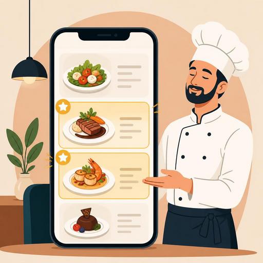
On a digital menu, guest behavior differs from a printed menu. There is scrolling on the screen, attention is dispersed more quickly, and product discovery becomes more dependent on sharper visual cues. For this reason, the chef's selection section must be positioned strategically within the QR menu.
The most functional approach is to place this section above the main categories, like a short display case. When the guest opens the menu, they should first find an answer to the question "where do I start?" Then they can move on to the relevant category. If the chef's selection tab gets lost down at the bottom of the menu, most of its potential is wasted.
On the design side, several basic principles stand out:
- Visual distinction: A badge, an icon, or a slight background difference can be used; however, an exaggerated clutter of colors should be avoided.
- Short description: Long text is not read on a mobile screen. One or two sentences are enough.
- Photo consistency: If photos are going to be used, a similar quality standard must be maintained across all recommended products.
- Not creating price shock: Gathering only the most expensive products in the chef's selection section can create the feeling among guests that "I'm being sold to."
When the restaurant's digital infrastructure is strong, updating this area also becomes easier. For example, it is possible to change the recommended products according to the weather, the time of day, stock status, or service intensity. Dishes that come out quickly can be brought to the front during lunch hours, and experience-focused main courses during evening service. This way the menu stops being a fixed list and turns into a living sales tool aligned with operations.
Which products should go in the chef's selection section?
The right product selection is the backbone of this strategy. Not every good dish is the right dish for the chef's selection. The following filters can be used in the selection:
- Products that give first-time guests confidence
- Dishes with a high presentation standard
- Products that do not create a bottleneck in the kitchen
- Options suitable for pairing with a side dish or drink
- Signature flavors that represent the brand identity
Consider a concrete example: a brunch café may have dozens of dishes. Instead of placing menemen, a croissant sandwich, and pancakes in the chef's selection section, a trio that both addresses different needs and tells the business's character is more sensible. For example, a signature egg dish, a shareable breakfast option, and a dessert distinguished by its special sauce. This way the guest selects not just a product but an experience.
Similarly, in a restaurant doing evening service, placing a starter, a main course, and a dessert in the chef's selection section can naturally grow the average basket. Especially when recommendation structures supporting this flow are used on the digital menu, the guest becomes more open to complementary orders instead of a single product.
How are testing, updating, and team alignment achieved?
The chef's selection section should not be prepared once and forgotten. Menu engineering is a living process. Which products are clicked more, which convert into orders, and which recommendations work better at which hours should be reviewed regularly. The advantage of businesses using a digital menu emerges precisely here: quick updates can be made without waiting on a printed menu.
However, making a change only on the screen is not enough. The service team must carry the same story. When the server says "the chef's recommendation," they should be able to build a sentence consistent with the product on the screen and explain why it is recommended. The kitchen team, for its part, must ensure that those products come out with the same quality every service. When this alignment is not established among the digital menu, the dining room, and the kitchen, the recommendation section remains superficial.
A practical implementation plan could be as follows:
- From your current menu, select 3-4 products that are operationally easy, profitable, and highly representative.
- Write short, concrete, and appetizing descriptions for each product.
- Move this section to the top of the QR menu and distinguish it visually.
- Give the service team standard recommendation sentences for these products.
- Monitor order behavior weekly and update the product list.
A well-structured chef's selection section is not a simple label added to the menu; it is a sales mechanism where attention management, trust-building, and operational sense come together. While easing the guest's decision, it highlights the business's strong products. Especially when flexible updating and smart menu management are possible on a QR menu infrastructure, this seemingly small touch becomes far more strategic.
If you want to manage more flexibly which products should truly stand out on your menu, Restomas's digital menu structure can help you simplify this process.