QR Menu Color Psychology for Restaurants: Practical Choices That Sell
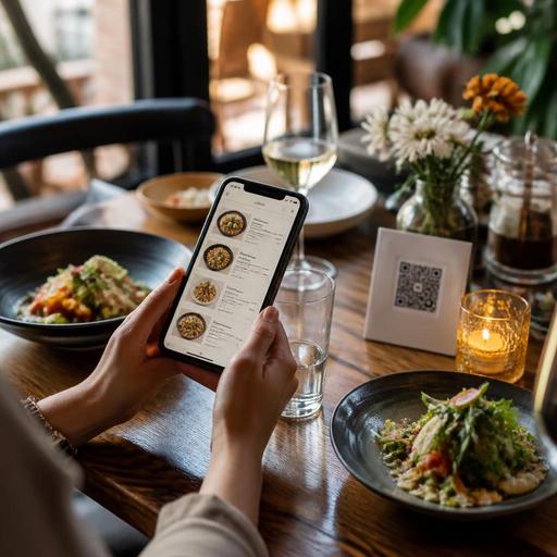
QR menu color psychology matters more than many restaurant owners expect. In a printed menu, guests often forgive small design flaws because the physical format feels familiar. On a phone screen, however, color directly affects readability, appetite appeal, trust, and how quickly a guest moves from browsing to ordering. The right palette can make dishes feel clearer, more premium, and easier to choose. The wrong one can create visual fatigue, hide important buttons, and reduce confidence at the exact moment a customer is deciding whether to add one more item.
For restaurants using digital menus, color is not just branding. It is part of service design. A QR menu has to work under daylight, warm dining-room lighting, and older mobile screens. It must support food photography, category navigation, allergy notes, upsells, and checkout prompts without overwhelming the guest. That is why color decisions should be practical first and aesthetic second.
Why color affects QR menu performance
Color influences how fast people understand information. In a restaurant setting, that matters because guests are rarely studying a menu in ideal conditions. They may be hungry, in a group, distracted by conversation, or trying to order quickly during a lunch rush. A QR menu should reduce effort, not add to it.
Good color use supports four core goals:
- Readability: high contrast helps guests scan item names, prices, descriptions, and dietary labels.
- Appetite appeal: warm and natural food-friendly tones can make dishes feel more inviting.
- Trust: balanced, clean colors make the menu feel current, organized, and reliable.
- Action: accent colors help guests notice buttons such as add to order, call staff, reserve, or view desserts.
For example, a burger concept might use charcoal, cream, and a controlled red accent to create energy without making the screen feel aggressive. A specialty coffee shop may use off-white, deep brown, and muted green to communicate comfort and craft. A seafood restaurant may choose navy and sand tones, but still keep text areas light enough for easy reading.
The key point is simple: guests should never struggle to read, compare, or act because the palette is trying too hard to look unique.
Which colors work best for different restaurant goals
There is no universal best color for sales, but there are smart matches between business goals and visual mood. Restaurant owners should choose colors based on cuisine, service style, average visit time, and the actions they want to encourage.
Warm colors for appetite and momentum
Red, orange, and terracotta often work well as accent colors because they create energy and direct attention. They can be useful for highlighting featured items, limited-time offers, combo upgrades, or checkout buttons. But they should rarely dominate the full interface. A bright red background behind long text blocks quickly becomes tiring on mobile.
Practical use: a pizza restaurant could keep the background light, use dark text for readability, and reserve warm red only for popular categories, promotion tags, and the add button.
Earth tones for comfort and authenticity
Brown, olive, beige, clay, and muted mustard can support brands built around handmade, local, slow-cooked, or natural ingredients. These colors often fit bakeries, cafes, grill restaurants, brunch concepts, and farm-to-table dining.
Practical use: a breakfast cafe can use cream for the main background, espresso brown for text, and olive for secondary navigation. This creates warmth without sacrificing legibility.
Dark palettes for premium positioning
Black, deep charcoal, forest green, and burgundy can make a menu feel upscale when used carefully. They often suit steakhouse, cocktail bar, chef-driven, or evening-focused concepts. The risk is readability. If text contrast is weak, premium quickly becomes frustrating.
Practical use: if using a dark theme, keep body text bright and large enough to read easily, and avoid placing long descriptions over textured or photographic backgrounds.
Cool colors for freshness and clarity
Blue and green can work well for healthy concepts, seafood, salads, juice bars, and modern casual brands. Green often communicates freshness. Blue can suggest cleanliness and calm, but it should be used carefully around food because it is less naturally associated with appetite than warmer tones.
Practical use: a poke or salad concept may use green as a freshness signal while relying on neutral whites and warm food photography to keep the menu appetizing.
Common QR menu color mistakes that hurt sales
Many restaurants do not have a color problem. They have a usability problem caused by color choices. The most common mistakes are easy to fix once you know what to look for.
- Low contrast text. Light gray text on white or dark gray on black may look modern in a mockup but becomes difficult to read on real phones.
- Too many accent colors. If everything is highlighted, nothing stands out. Guests need one clear visual hierarchy.
- Bright backgrounds behind food photos. Neon or highly saturated backgrounds can make dishes look less natural and distract from the product.
- Using brand colors everywhere. Your logo palette may be strong for signage, packaging, or social media, but not ideal for long reading on a mobile menu.
- Ignoring lighting conditions. A menu that looks elegant on a designer's monitor may fail in outdoor seating, under yellow bulbs, or on older devices.
A practical test is simple: open your QR menu on three different phones, in daylight and indoor light, and ask someone unfamiliar with the design to find a starter, identify a vegetarian item, and add a dessert. If they hesitate, color and hierarchy may be part of the problem.
How to build a high-converting color system for your digital menu
Instead of choosing colors page by page, create a simple system. This keeps the menu consistent and helps staff update it without breaking the experience.
- Primary background: choose a calm neutral such as white, cream, or soft charcoal.
- Primary text color: use a highly readable dark or light opposite, depending on the background.
- Accent color: pick one main action color for buttons and important highlights.
- Secondary accent: use sparingly for tags such as spicy, new, best seller, or vegetarian.
- Photo treatment: keep image backgrounds natural and avoid filters that distort real food colors.
This approach improves more than appearance. It supports operations. When your team updates specials, seasonal dishes, or sold-out items, a consistent color system prevents confusion. Guests quickly learn what a highlighted button means, what a dietary tag looks like, and where to tap next.
It also helps with menu engineering. If your most profitable category deserves more attention, color can support that without feeling pushy. For example, a dessert section can use slightly warmer accents near the end of the meal journey, while lunch combos can receive clearer visual emphasis during peak daytime ordering.
What restaurant owners should do next
If you want better results from your QR menu, start with an audit rather than a redesign. Review your current menu on actual guest devices and focus on behavior, not personal taste. Ask whether the color palette helps customers decide faster, trust the content, and notice profitable actions.
Use this checklist:
- Can guests read every item easily without zooming?
- Is there one obvious color for primary actions?
- Do food photos look natural and appetizing?
- Are category labels and dietary tags easy to distinguish?
- Does the menu still work under different lighting conditions?
- Do the colors match your brand without overwhelming usability?
Then test one improvement at a time. Change your button color. Simplify the background. Increase text contrast. Reduce the number of highlight colors. Small adjustments often produce a smoother guest experience than a complete visual overhaul.
Platforms such as Restomas make these updates easier because restaurants can manage digital menus, categories, visuals, and service flows in one place, helping teams keep branding practical while improving the guest journey.