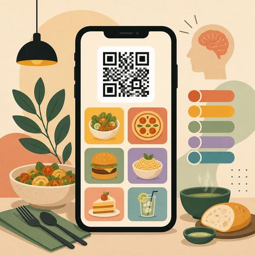
A Guide to Boosting Sales with QR Menu Color Psychology
QR menu color psychology is one of the design areas that directly affects what a guest sees first on screen, which product they find more appetizing, and how quickly they make an ordering decision. In restaurants, a good QR menu is not just a digital list; it is a sales screen that carries brand perception, highlights products, and simplifies operations. For this reason, color choice should be evaluated not merely as an aesthetic preference, but in terms of product discovery, basket size, and user flow.
But there is an important balance here: not every shade of red boosts sales, not every black menu looks premium, and not every green creates a perception of healthiness. The effect of colors works together with restaurant concept, lighting conditions, photo usage, category structure, and readability on a mobile screen. Especially on a QR menu, since guests make decisions within seconds, colors need to guide without distracting.
Why is color psychology more critical on a QR menu?
With a printed menu, the guest can physically browse between pages. On a QR menu, however, the screen is small, attention span is short, and options are consumed with a flick of the finger. That is why colors do not only produce emotional associations; they also become a navigation tool. Category headings, featured products, campaign labels, sold-out indicators, and call-to-action buttons are all read through color.
For example, during a busy lunch service a guest wants to decide quickly. If the main categories blend into one another in the menu, accent colors are used randomly, and prices or product images fade into the background, decision time gets longer. This creates order delays, indecision, and sometimes the behavior of closing the menu. In contrast, a well-structured color system speeds up the menu flow without tiring the guest.
- Primary color: Carries the brand and the overall atmosphere.
- Accent color: Used on products, campaigns, or buttons to be highlighted.
- Neutral colors: Serve as the background, description text, and balancing element.
- Status colors: Functional for markers such as not-spicy/spicy, new product, sold-out product.
In successful QR menus, these roles are clear. Color usage that tries to make everything pop at once ends up highlighting nothing.
Which color works when?
It is a mistake to manage color psychology with one-sentence rules of thumb. The right approach is to build a color function according to restaurant type.
Red and orange: speed, energy, and attention
Shades of red and orange convey a sense of fast consumption, warmth, and movement. They can work for burgers, pizza, street food, takeaway-focused brands, and concepts aimed at a younger target audience. But rather than painting the entire interface red, it is more effective to use these tones in areas like "most popular," "chef's recommendation," "add to cart." Otherwise the screen looks aggressive and product photos stay in the background.
Green: freshness, ingredient confidence, and lightness
Green is a strong choice for salads, vegan cuisine, breakfast, light foods alongside third-wave coffee, or businesses that emphasize natural ingredients. The key here is to use green not just decoratively but descriptively. For example, green tones on vegan, gluten-free, or seasonal product badges quickly create meaning for the guest. This produces a sense of filtering within the menu.
Black, charcoal, and dark tones: premium perception
At steakhouses, cocktail bars, fine dining, or chef restaurants, dark tones provide a strong frame. However, using low-contrast gray text on a dark background on a mobile screen hurts readability. Making reading harder in the name of looking premium creates friction instead of sales. If a dark background is to be used, the contrast of the product name, price, and buttons should be tested specifically.
Why should blue be used carefully?
Blue conveys a sense of technology, cleanliness, and trust; but in the food category its natural appetite association is often weaker. For this reason, blue is more suitable as a supporting interface color rather than the main sales color. It can succeed when used in a controlled way at seafood restaurants, beverage menus, or modern cafe brands.
The 5 most common mistakes in color selection
- Confusing brand color with menu function. Drowning the whole menu in the same tone just because the logo color looks nice reduces usability.
- Choosing backgrounds that clash with photos. Warm-toned food photos in particular lose their impact on similarly warm backgrounds.
- Using too many accent colors. When campaigns, new products, popular products, and buttons all shout in different ways, the order of priority breaks down.
- Treating readability as an afterthought. Light gray text, low contrast, and small type create serious problems on a mobile screen.
- Building an inconsistent color language across categories. Using one logic for desserts, another for beverages, and another for main courses fragments the menu experience.
These mistakes usually arise not from technical issues, but from a lack of decision-making. First decide what will stand out in the menu, then let color serve that.
How do you build a QR menu color system that supports sales?
A practical method is to think of the menu in three layers: brand perception, product priority, user action. In the first layer, the character of the restaurant appears. In the second layer, high-margin or signature products stand out. In the third layer, the guest is enabled to make a choice easily.
For example, imagine a brunch cafe. A cream or light beige background can create a natural, calm foundation. Green tones can be used on freshness and ingredient badges. Warm terracotta or soft orange can draw attention in "recommended product" or upsell areas. Such a system both looks appetizing and avoids creating a clamorous mess in the menu.
For a burger brand, black typography on a white or light background, with red or orange accents, can create a faster and clearer experience. The aim here is to keep product images dominant and let the guest see combinations easily. For adding a beverage, upgrading the menu, or suggesting extra sauces, it is important to use the same accent tone consistently.
When the QR menu infrastructure is flexible, managing this system becomes easier. Features such as category-based editing, product labels, hiding out-of-stock products, updating campaign areas, and quickly changing the image-text balance keep color decisions aligned with operations. Design produces real benefit only when it is supported by up-to-date menu management.
An actionable test plan for restaurant owners
The best way to use color psychology correctly is not guessing, but controlled experimentation. Before undertaking a major design overhaul, you can apply the following plan:
- Set a goal: Is it to sell more desserts, make signature beverages more visible, or increase ordering speed?
- Choose a single variable: Don't change the background, button color, and category structure all at once.
- Focus on one category: For example, test the accent color only in the starters or beverages section.
- Get feedback from staff: Observe where guests get stuck most and which products they keep asking about.
- Think seasonally: The same color effect should not be expected from a summer menu and a winter menu.
A concrete example: if dessert sales are low, first review the position and images of the dessert category within the menu. Then try an accent tone on the dessert cards that distinguishes them from other categories yet stays in harmony with the brand language. Micro-headings or badges such as "after-meal recommendation" can also support this visibility. The goal here is not just to look nice, but to direct the right attention at the moment of decision.
Conclusion: Color is not decoration, it is part of the sales flow
In QR menu design, color psychology determines how the restaurant's digital storefront works. Correct color usage guides the guest without tiring them, makes products more understandable, and strengthens brand perception. Incorrect usage, on the other hand, can make the menu complicated, tiring, and ineffective. For this reason, color selection is not a matter to be left to the designer's taste alone; it is part of menu engineering.
If you see the QR menu in your restaurant not just as a digital necessity but as an active sales space, then addressing the color system, category design, and product visibility together is the best place to start. With Restomas, managing your QR menu in a more organized, up-to-date structure that makes decisions easier can simplify this process.