A Guide to Influencing the Order Decision with Food Photos on Your QR Menu
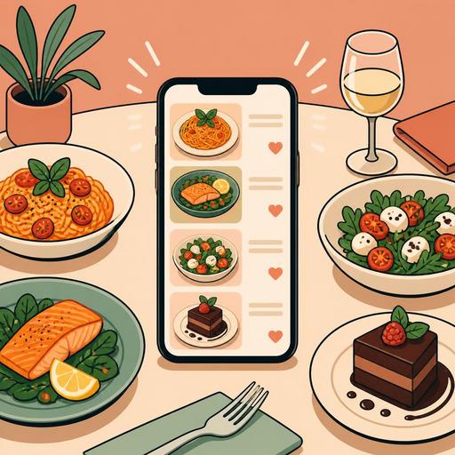
Food photos on a QR menu are one of the most powerful elements that speed up the guest's order decision. But the critical point here is not adding randomly nice-looking shots to the menu; it is building a visual system that whets the appetite, inspires trust, and is compatible with operations. Well-chosen photos can help the guest decide what to order more quickly, make high-margin products visible, and reduce dissatisfaction arising from mismatched expectations. Bad photos, on the contrary, can make product quality look lower than it is, clutter the menu, and create decision fatigue.
Especially on QR menus consumed on a phone screen, the job of the image is not merely to "look elegant." The image affects the perception of portion size, the clarity of content, the hot-or-cold feel of the product, the impression of freshness, and the perception of price. For this reason, photography, design, and menu management must be thought through together. For restaurant owners, the right question is this: Which products should I photograph, how should I present these images, and how should I track their performance?
Why does a photo affect the order decision so strongly?
On a QR menu, the guest often decides without asking the server long questions. Drawing meaning from an image is faster than scanning text on a phone screen. Especially for first-time guests, the photo partly takes the place of the product description. For example, the phrase "crispy chicken bowl" does not create the same image in everyone's mind; but a good photo instantly reveals the content and presentation.
The effect of the image emerges in three basic areas:
- It reduces uncertainty: The guest more easily understands how the dish will look, the approximate portion feel, and the serving style.
- It triggers appetite: Elements such as texture, color contrast, and the sense of steam make the product more appealing.
- It speeds up the decision: A user who does not read long descriptions makes a quicker choice with the help of the image.
There is an important balance here: the photo must represent the product that is actually served. Otherwise, even if the first order is taken, trust is lost on the second order. Especially for highly visual products such as burgers, pizza, desserts, and breakfast plates, the gap between expectation and reality is directly reflected in reviews and the likelihood of a repeat visit.
Should every product have a photo? No, being selective is more effective
One of the common mistakes restaurants make is adding a photo of every item on the menu. This approach can weigh the QR menu down, clutter the screen, and distract attention. Instead, it is more sound to highlight products selected according to the sales strategy.
The product groups that can be prioritized are as follows:
- Signature products: dishes that distinguish the business from its competitors.
- Products that are hard to describe: dishes whose name is unfamiliar or whose presentation is hard to convey in text.
- High-margin products: items that are both satisfying and advantageous for the business.
- Newly added products: seasonal or campaign products the guest needs to notice.
For example, in a coffee shop it may not be essential to photograph all the classic espresso-based drinks. However, specially presented signature drinks, desserts, or breakfast plates work more powerfully with an image. In a pide restaurant, on the other hand, instead of every pide, it may be more efficient to photograph products with high decision impact such as the mixed, diced-meat, and special chef's pide.
Common features of food photos that contribute to sales
A good food photo starts not with expensive equipment but with the right intent. Simple and honest shots that the guest can quickly understand on the screen are often more functional than overly stylized photography. The most effective photos for a QR menu usually have the following features:
- Single-focus composition: The product should be the star of the frame, and the background should not steal attention.
- Natural or soft light: Harsh shadows, oily glare, and muddy colors can reduce appetite.
- Accurate portion representation: When the product arrives at the table, the guest should be able to say "it's the same as in the photo."
- Texture display: Details such as melted cheese, a crispy surface, sauce flow, and fresh greens are influential at the moment of decision.
- Screen compatibility: It should be understandable even at a small size on a phone screen.
Let's give a concrete example: on a dessert menu, instead of only a distant top-down shot of the plate, a closer frame showing the filling or the texture layer is often more descriptive. Similarly, for a noodle bowl, a slightly angled shot in which the ingredients are visible can be more appetizing than a flat top-down angle.
Common visual mistakes
- The product's color changing due to excessive filter use
- Adding to the photo garnishes that are not actually on the plate
- Using inconsistent lighting and backgrounds across different products
- A blurry or pixelated appearance due to low resolution
- Cluttering the selection screen by using too many photos on the menu
QR menu design and photos must work together
A successful result does not come from a good photo alone; the photo's place within the menu is at least as important as the photo itself. Even if a product photo is strong, it can lose its effect due to wrong ordering, a weak category structure, or a confusing screen flow. For this reason, in QR menu management it must be planned for which products, in which order, and with what kind of description the photo will be shown.
For example, the products you most want to recommend can be presented with an image at the head of the category. A short but clear description can sit next to the photo: the main ingredient, the cooking style, and the distinguishing element. This way the guest orders based not only on the eye but also on information.
The flexibility of the digital menu infrastructure provides an advantage here. Updating photos seasonally, testing visuals on new products, removing an out-of-stock product from visibility, or highlighting certain categories is far more practical than with a printed menu. Restaurants should use this flexibility not only for aesthetics but for operational accuracy.
How do you measure photo performance?
The approach of "we added a photo, it looks nice" is not enough. The real question is which image improved the decision process for which product. There is no need for a complex analytics system for this; even regular observation produces value.
The following action plan can be applied:
- Identify the priority 5-10 products: Select the products to which photos will be added or updated.
- Simplify the descriptions: Write clear product descriptions consistent with the image.
- Monitor for a certain period: Note order frequency, questions asked of the server, and feedback arising from mismatched expectations.
- Replace weak images: For products that are clicked but do not convert into orders, renew the photo or the description.
- Update by season: Use new images for summer drinks, winter soups, and special-day dishes.
For example, items that guests frequently ask about, such as "is this product spicy?", "how is the portion?", or "what's in it?", may be weak in terms of image and description. When such products are supported with a photo, both the recurring-question burden on the service team decreases and the ordering experience becomes more fluid.
A plan for building an actionable visual system for restaurant owners
The best result comes not from a one-time shoot but from a sustainable content system. If a new product is being added to the menu, the photo standard for that product should also be defined in advance. This way, a few months later, you do not accumulate disconnected images at different quality levels on the menu.
For a practical system, you can use the following framework:
- Set a shooting standard: Keep the background, angle, lighting, and plate arrangement consistent.
- Create a visual priority for each category: Define the different needs for main courses, desserts, drinks, and breakfast.
- Decide together with operations: Do not use presentations that will not actually come out of the kitchen.
- Prepare a seasonal update calendar: Don't let photos fall behind menu changes.
- Manage the digital menu like a living area: Optimize the photo, description, and product order together.
In conclusion, food photos on a QR menu are not merely an aesthetic element; they are a tool that builds a bridge among sales, trust, and operations. Restaurants that visualize the right products in the right way make the guest's decision easier while also simplifying their own teams' work. Solutions that make digital menu management flexible, like Restomas, make it easier to keep this visual order up to date and manageable.
If you want to manage the images on your QR menu in a more organized, up-to-date, and operations-aligned way, you can examine the digital menu infrastructure offered by Restomas.