Influencing the Order Decision with Color Choice in QR Menu Interfaces
Color choice in a QR menu interface is not merely an aesthetic preference; it can directly affect how long the guest stays on the menu, which products they pay attention to, and how comfortable they feel while ordering. For restaurants, cafés, and food-and-beverage businesses, the digital menu is no longer just a list; it is at the same time an area of sales, guidance, and experience design. For this reason, colors should be chosen not because "they look nice" but according to the product structure, the brand tone, and the order flow.
A common mistake on the subject of color psychology is to think that a single color will produce the same result in every business. Yet a burger restaurant, a third-wave coffee shop, a fine dining establishment, or a family restaurant are not managed with the same color logic. What matters on a QR menu is that the colors strengthen the category hierarchy, make the buttons visible, present products appetizingly, and do not tire the user. The right combination helps the guest decide faster; the wrong combination can create indecision, eye fatigue, and an early exit from the menu.
Why does color psychology work differently on a QR menu?
There is a fundamental difference between a printed menu and a QR menu: on a digital screen, light, contrast, and scrolling behavior come into play. Instead of holding the menu and examining it at length, the guest often does a quick scan on the phone screen. For this reason, the job of the colors should not be only to create atmosphere but at the same time to provide direction.
For example, shades of red and orange can give a sense of movement, warmth, and vitality. For this reason, they can be attention-grabbing in campaign areas, on "most preferred" labels, or on call-to-action buttons. However, when the entire interface is drowned in red, the product cards blend into one another and the user is left confused about where to look. Similarly, shades of green evoke freshness, naturalness, and lightness; they can work well for salads, vegan products, cold drinks, or brands with a sustainable-kitchen emphasis. But very low-contrast light-green backgrounds can make on-screen reading difficult, especially in sunlight.
The basic principle here is this: on a QR menu, colors must carry function at the same time as they create emotion. If the guest cannot find a product, cannot comfortably read the price, or cannot select the order button, then even if the color palette is psychologically "correct," it is commercially a failure.
Which colors give stronger results for which type of restaurant?
There is no single "color that boosts sales"; but certain color families may be more suitable for certain business goals. What matters is matching the color with the business's product structure and the customer's expectations.
- Red and orange: Can create an effect of fast consumption, energy, and attention. Can be used as an accent color in burger, pizza, street-food, campaign-focused menus, and concepts aiming for a fast order flow.
- Green: Gives a sense of freshness, lightness, and ingredient transparency. Effective for category distinction in bowl, vegan, healthy-living, or breakfast-focused businesses.
- Brown and earth tones: Create a handmade, natural, rustic, and trust-inspiring feel. Strong in coffee shops, bakeries, steakhouse concepts, and businesses serving local cuisine.
- Black and dark tones: Can create a premium, strong, and refined perception. Effective in fine dining, cocktail bars, and chef restaurants together with the right photography and typography.
- Blue: Gives a sense of trust and calm; however, it may not be strong on the appetite side in every concept. It can be considered as a helper color, mostly in drink menus, seafood concepts, or interfaces meant to convey a tech feel.
Let's give a concrete example: for a brunch café, designing the entire interface on a black background may look premium but can reduce the sense of warmth. The same business can offer both an appetizing and a sincere experience with cream, light brown, and soft green tones. By contrast, at a venue with cocktail-heavy evening service, a dark background and gold-toned accents can strengthen the "special selection" perception of the products.
The real factor that boosts sales: accent color, contrast, and decision moments
On a QR menu, sales performance often depends less on the main color and more on where and how the accent color is used. Because the order decision is formed at small touchpoints: category selection, tapping the product card, seeing add-on options, adding to the basket, and the payment step.
For this reason, a clear visual hierarchy must be established in the following areas:
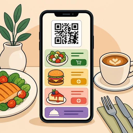
- Category tabs: The active category must be distinctly separated from the inactive ones.
- Featured products: Chef's recommendations, new products, or high-margin products should carry a separate accent area.
- Add-to-basket button: It should be in a color that does not blend into the background and is selected at a single glance.
- Extra selections: Decision areas such as sauce, cooking level, and size selection should not be confusing.
- Alerts and information areas: Spiciness level, allergen information, or out-of-stock status should be clearly distinguished with colors.
For example, on a menu prepared with neutral tones, marking only the "Add to Basket" button with a warm orange makes the action visible without tiring the user. Likewise, for a "Chef's recommendation" label, using a small but strong accent area instead of coloring the entire card is more elegant and more functional. The goal here is not to shout with colors, but to simplify the decision path.
A practical approach for restaurants is to also relate the QR menu design to seasonal campaigns. In a summer menu, light and cool tones that highlight refreshing drinks can be preferred, while in a winter menu, warmer accent colors for hot drinks or comfort-food categories can be used. This way the menu becomes visually aligned with seasonal sales goals as well.
The 5 most common mistakes in color choice
Many businesses think the job is solved by carrying their brand colors directly into the QR menu. Yet brand identity and usability are not always the same thing. The following mistakes are common:
- Using an overly dark background: Readability drops, especially for product descriptions and prices.
- Low contrast: Light gray text, pastel backgrounds, or faint buttons tire the user.
- Emphasizing everything: If every product looks "special," then no product actually stands out.
- Clashing photos with interface colors: Warm-toned food photos can lose their appetizing effect against the wrong background.
- Inconsistent design across branches: In multi-branch structures, each menu following a different color logic weakens brand perception.
Especially on menus with many products, a lack of color discipline lengthens the guest's decision time. This in turn creates an indirect operational cost during busy service hours. The guest decides later, the staff has to give more guidance, and table turnover can be affected.
An actionable color test plan for restaurant owners
The way to use color psychology correctly relies on controlled experimentation, not guesswork. To do this, small tests can be run without entering an expensive redesign process. The flexibility of the digital menu infrastructure is important here; when category orders, product labels, featured areas, and visual emphasis points can be updated easily, the business learns faster.
A simple implementation plan to get started
- Choose a goal: Will cold-drink sales increase, will the dessert-add rate rise, or will premium products stand out?
- Proceed with a single variable: Instead of changing the entire menu at once, test only the button color, the campaign label, or the category accent tone.
- Evaluate together with photos: Colors work not in isolation but together with product images.
- Observe by service time: User behavior may differ between the lunch rush and the more relaxed evening service hours.
- Get feedback from the staff: Servers' observations like "the guest can't find this area" or "that product is asked about more" are valuable.
For example, if the dessert category is visible yet gets few orders, it is possible that the problem is not in the products but in the menu flow. Gathering desserts into a visible block after the main courses, using a warm accent color, and distinguishing the product names more clearly is often the first step. Similarly, creating a separate color code or a "goes well with" area for high-margin drinks can strengthen the cross-sell opportunity.
At this point, in systems that provide digital menu management like Restomas, the ability to update the menu layout, restructure categories, and manage product highlights in a more controlled way makes it easier for color decisions to proceed in alignment with operations.
Conclusion: Color is not decor; it is part of the sales flow
Color choice on a QR menu is not a matter only for the design team; it is the intersection of sales, operations, and customer-experience decisions. The right colors carry the guest's attention to the right place, speed up the decision, and make the menu feel safer. The wrong colors, on the other hand, can make even the best products invisible.
For restaurant owners, the right approach is to build a basic palette suited to one's own concept instead of copying trend colors, and then to run controlled tests on buttons, category areas, and featured product blocks. Successful QR menu design begins not with the question "which color is more beautiful?" but with the question "which color makes which decision easier?"
If you want to make the visual structure of your QR menu more efficient, with Restomas you can develop your menu flow and digital presentation in a more controlled way.