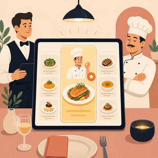
More Sales with a Chef's Recommendation Section on Your Restaurant Menu
The chef's recommendation section on a restaurant menu is a powerful menu-engineering tool that speeds up the guest's decision-making process and, when structured correctly, gives visibility to more profitable products. Many businesses use this section merely as a "featured dishes" area. Yet a well-designed chef's recommendation tab activates psychological elements such as attention management, choice architecture, a sense of social proof, and a trust effect all at once. The result is not only more sales; it is also a clearer order flow, better stock planning, and a more consistent guest experience.
In this article, we will examine in detail why the chef's recommendation section works, which products should be placed there, how to structure it in the QR menu and digital order flow, and how to make it sustainable on the team side.
Why is the chef's recommendation tab so effective?
A guest looking at a menu often does not examine every option with equal attention. Especially on crowded menus, people look for shortcuts that reduce mental load. The chef's recommendation section comes into play precisely at this point: it creates the feeling that "someone has done the first filtering for me." This reduces indecision and shortens the time it takes to place an order.
The psychological mechanism here is simple. When the guest trusts the business's expertise, they perceive the risk of choice as lower. The thought "if the chef recommends it, the chance of it being bad is low" becomes active. This effect is more pronounced especially among first-time customers. Instead of making a random choice on a menu they don't know, they gravitate toward the products they are guided to.
Moreover, this section reduces the clutter created by presenting all products on the menu as equal. On menus where every dish stands out to the same degree, decision-making becomes difficult. The chef's recommendation tab, on the other hand, moves the products the business has strategically selected to the focal point. This focus should be used not just to attract interest, but to strike a balance among high satisfaction potential, operational suitability, and profitability.
Which products should be placed in this section, and which should not?
The most common mistake is filling the chef's recommendation section entirely with products the owner likes or the kitchen is proud of. Yet the right choice must consider both guest psychology and operational realities together. The goal here is not to make a "best dishes" list, but to select the most appropriate dishes to sell.
Products that should be prioritized
- Products that are easy to decide on: dishes with an understandable name, clear content, and broad appeal.
- Products with strong presentation: options that whet the appetite with a photo or a short description.
- Products that come out stable in operation: dishes that do not lose quality during busy service.
- Products with balanced profitability: options that are not just expensive but have predictable cost control.
- Products bearing the brand's signature: dishes that distinguish the business from its peers and can generate repeat orders.
Products to stay away from
- Dishes with highly variable preparation times that could disrupt service
- Products with high stock risk and irregular supply
- Very niche options that are hard to understand without a description
- Products the kitchen executes flawlessly only during quiet hours
For example, at a brunch café, instead of placing only the most expensive dishes in the chef's recommendation section, it may be smarter to place a specialty omelet with a fast preparation flow, a signature pancake with high perceived value, and a breakfast plate to which a drink is easily added. For a steakhouse, a cut of meat with a strong kitchen standard, a side dish differentiated by the chef's sauce, and a starter combination suitable for sharing may work better.
Menu design details that increase the psychological effect
The chef's recommendation tab creates a sales effect not only through content but also through the form of presentation. The goal here is not to use a loud advertising language, but to create a guiding yet trust-inspiring experience.
- Limit the number of options: Too many recommendations cease to be recommendations. In general, a structure of 3 to 5 products works more clearly.
- Write short but appetizing descriptions: Convey character rather than an ingredient list. For example, a phrase like "served with charred eggplant" creates a warmer effect than a flat technical description.
- Establish visual hierarchy: On a digital menu, a badge, a frame, or a distinct card design can be used. But starring every product reduces the effect.
- Use decision-easing language: Phrases like "ideal for first-timers" or "suitable for sharing" reduce choice stress.
- Add a cross-sell hint: Placing a suitable drink or starter suggestion next to the recommended dish can grow the basket.
There is a fine line here: guiding without appearing manipulative. If the guest gets the feeling that "someone is trying to sell me something," they pull back. But if the feeling that "the choice has been made easier for me" arises, they move closer to the recommendation. For this reason, it is important that the language be natural, sincere, and trust-inspiring.
How should the chef's recommendation be structured in the QR menu and digital ordering?
While the chef's recommendation section stays fixed on a printed menu, in QR menu and digital order systems this area can be managed far more flexibly. The featured products can be changed according to the time of day, stock status, weather conditions, or branch traffic. This flexibility turns the psychological technique into an operational advantage.
For example, showing products that come out quickly and have shorter preparation times in the chef's recommendation section during lunch hours can help maintain the service tempo. During evening service, signature products with higher perceived value can be brought to the front. Similarly, on a rainy day, hot soup or comfort-food-focused recommendations become more meaningful, while on a summer evening, refreshing dishes and cold-drink pairings do.
Another point to watch on the digital side is that the recommendation section must not get lost within the menu. When the guest opens the QR menu, this section should appear on one of the first screens they see, but not so aggressively that it overshadows the main menu. A short description, a clear image, and an easy add-to-order flow are important. If the system allows, simple suggestions such as "the most preferred pairing with the chef's recommendation" can also be added.
Digital menu infrastructures like Restomas provide an important advantage to businesses here: it is possible to update menu items quickly, highlight specific products, instantly pull out-of-stock items, and create different recommendation flows by branch. This way, the chef's recommendation section stops being a static display case that is prepared once and forgotten, and turns into a living sales and experience tool.
In-team implementation: Server, kitchen, and management must speak the same language
The effect of the chef's recommendation tab does not depend on menu design alone. The dining-room team, the kitchen, and management must collectively own the logic of this section. Otherwise, the product recommended on the menu and the product recommended in the field diverge, and guest trust is damaged.
Instead of just telling the server team to "push these," it is more sound to give a short talking framework for each recommended product. For example:
- Who is this product suitable for?
- What is its strongest feature?
- Which drink or side dish does it pair well with?
- In which situation should an alternative be recommended?
On the kitchen side, the recipe standard of the recommended products must be clear. Because a dish presented as the chef's recommendation creates a high level of expectation. A product that comes out excellent one day and average the next weakens the credibility of this section. Management, for its part, must track which products actually draw interest, which recommendations convert into baskets, and which are only viewed and passed over.
A 7-step chef's recommendation plan you can apply right away
- List your most consistent recent products.
- From among these products, set aside 3-5 options that are easy to decide on.
- Write a one-sentence, appetizing but simple description for each product.
- Add a pairing product or drink link to each recommendation.
- Make this section visible on the first screens of the QR menu.
- Prepare short recommendation sentences for each product for the service team.
- Review weekly which products are chosen more often and update the list.
In short, the chef's recommendation tab is not a decorative area; it is a strategic tool that manages attention, builds trust, and eases the order decision. When the right product selection, the right language, the right digital visibility, and team alignment come together, this small area can become one of the most effective parts of the menu.
If you want to manage the featured products on your menu more flexibly and simplify the digital experience, Restomas's QR menu and order flows can make it easier to implement this setup.