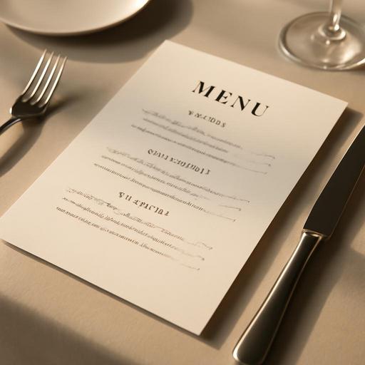
Restaurant Menu Design: 7 Psychological Techniques That Boost Sales
In the restaurant business, a menu is far more than a piece of paper listing dishes. A well-designed menu guides your customers' choices, increases your profit margin, and strengthens your brand identity. So how does a menu design turn into a sales tool? Here are seven science-backed psychological techniques that will increase your restaurant's revenue.
1. The Eye Movement Map: The Golden Triangle Rule
Research shows that people follow a specific eye movement pattern when scanning a menu. Most people glance first at the top right corner of the menu, then move to the center and the top left corner. These areas are known as the "golden triangle."
By placing your high-margin items in these zones, you can significantly increase the likelihood that customers will notice and order them. For example, star items such as your signature sauced steak or chef's recommended pasta should sit in these areas.
Practical tip: On single-page menus, the top right is the strategic zone; on two-page menus, the top right corners of both pages are key.
2. Displaying Prices: Avoid Currency Symbols
The way you write prices on your menu directly affects customers' spending behavior. Writing a currency symbol or the abbreviation next to the price heightens the "pain of paying" in the customer's mind.
Instead, write just the number: for example, "185." Also avoid using decimal places (such as 185.00); this places unnecessary emphasis on the price. Research indicates that on menus without currency symbols, customers spend an average of 8-12% more.
- Right: "Grilled Sea Bass 285"
- Wrong: "Grilled Sea Bass 285.00 $"
- Wrong: "Grilled Sea Bass - 285 USD"
3. Descriptive Item Names: The Power of Storytelling
Writing "Farm-Raised Chicken" instead of "Chicken," or "Nonna's Handmade Mushroom Fettuccine" instead of "Pasta," significantly increases sales. Adding geographic origin, preparation method, or an emotional connection to your item descriptions raises perceived value.
Detailed item descriptions create flavor expectations in the customer's mind and make the ordering decision easier. But be careful: overly long descriptions can cause confusion. Balanced descriptions of 15-25 words are ideal.
Example: "Stone-oven-baked sea bream with lemon and thyme aromas, paired with fresh seafood from the Aegean coast."
4. Anchor Pricing: Why Do Expensive Items Matter?
Keeping an extremely expensive item on your menu makes the other items look more reasonable. This is known as the anchor pricing technique.
For example, when there is a Wagyu steak priced at 850 on the menu, a beef rib-eye at 320 feels much more reasonable to the customer. Even if no one orders that expensive item, it serves to boost sales of your mid-to-upper-tier products.
This strategy also helps you position your restaurant as premium.
5. Visual Hierarchy: Boxes, Frames, and Icons
The human eye naturally focuses on whatever is different. Placing certain items inside boxes, highlighting them with colored frames, or using icons such as stars or chef's hats draws attention.
However, use this technique without overdoing it. If there are too many boxes or highlights on the menu, none of them will stand out. Ideal usage: no more than 2-3 highlighted items per page.
- A "Chef's Recommendation" badge
- A "Seasonal Favorite" label
- A "Most Popular" icon
On digital menus these highlights can be animated, but they should not strain the eye.
6. Category Layout: Fewer Options, More Sales
It may seem paradoxical, but too many options create decision fatigue in customers and slow down the ordering process. Five to seven options per category is the ideal number.
You should arrange categories logically:
- Starters / Appetizers
- Salads
- Main courses (can be divided into subcategories: seafood, meat, chicken, vegetarian)
- Sides
- Desserts
- Beverages
Within each category, order items by popularity and strategic importance rather than by profit margin. Placing your most profitable item in the middle of the list is usually most effective.
7. Color Psychology and Typography Choices
Colors send subconscious messages. Red and yellow stimulate appetite (which is why fast-food chains use these colors), blue is calming but can suppress appetite, and green evokes associations of health and naturalness.
Typography matters too. Choose legible fonts that suit your brand identity. Handwritten fonts convey a premium, exclusive feel, but if they are illegible they have the opposite effect. Use no more than 2-3 different fonts on a menu.
On digital menus, mobile compatibility is critical: fonts must remain easy to read even on small screens.
The Digital Menu Advantage: Data and Flexibility
Unlike traditional printed menus, digital menus offer real-time updates, the ability to run A/B tests, and the opportunity to analyze customer behavior. You can see which item is viewed most often and which images get the most clicks.
You can make instant changes during seasonal shifts, price updates, or stock changes, and save on printing costs. QR menus are also a hygienic solution that reduces physical contact.
Conclusion: Your Menu Is Your Silent Salesperson
Menu design is a part of restaurant operations at least as important as the kitchen itself. With eye movement patterns, price psychology, descriptive language, strategic highlights, and the right category layout, you can turn your menu into a powerful sales tool.
Remember: customers interact with your menu for an average of just 109 seconds. Using this short window as efficiently as possible directly affects your sales and customer satisfaction.
With Restomas, you can optimize your digital menu solutions, analyze your customer data, and take your business one step ahead.