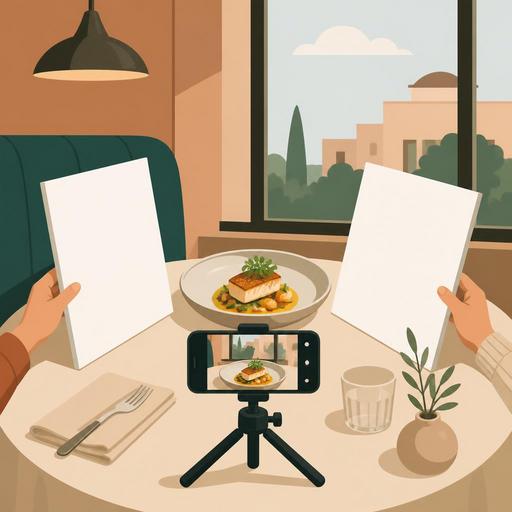
A Guide to Shooting Menu Photos Without a Studio for Restaurants
A guide to shooting menu photos without a studio for restaurants offers a practical roadmap for businesses that want to refresh their menu but get results without setting up a professional studio. A good food photo is not just about aesthetics; it clarifies what the customer should expect, shortens decision time on the menu, and makes products more understandable, especially in the QR menu experience. Moreover, photos shot with the right method can create a consistent and reassuring menu language even without expensive equipment.
1. Start with menu strategy before the camera
The most common mistake is trying to photograph every item one by one. Yet not every item may need a photo. First, divide your menu into three groups: the items you want to highlight for sales, the items the customer struggles to understand without a description, and signature dishes with high visual power. This way, on shooting day it becomes clear what you're shooting and why.
For example, for a burger restaurant, the classic cheeseburger, truffle fries, and combo presentations may be the priority. In a coffee shop, on the other hand, not the latte but special drinks whose layers are visible, or accompanying dessert sets, may perform better. The goal is not "the most items," but to shoot the items that influence the decision the most.
2. Use daylight in a controlled way, not at random
If you don't have a studio, your biggest advantage is the window. But window light isn't a solution on its own; the direction and harshness of the light determine the result. The best starting point is to set up a table near the window but not in direct sunlight. Harsh sunlight creates blown-out bright areas and hard shadows on the plate. You can soften the light with the help of a thin sheer curtain or a light-colored background.
Place the food so that it receives light slightly from the side rather than directly facing the window. This method gives a sense of volume, especially with items whose texture matters, such as soup, pasta, burgers, and desserts. If the shadowed side gets too dark, bounce the light back with white cardboard, a light-colored placemat, or a clean menu cover.
3. Simplify the background and make the product the subject
In a menu photo, the product is sold, not the decor. Unnecessary cutlery on the table, a heavily patterned cloth, unbranded sauce bottles, or messy kitchen details on the table reduce the product's impact. For a good DIY setup, the following surfaces, which most businesses already have, are enough:
- A plain wooden table
- A matte stone or ceramic surface
- Light-colored plain serving paper
- A single-color large placemat
The critical point here is that the background doesn't fight with the product's color. Creamy pasta can get lost on a light background; in that case, a darker neutral surface works better. Fried items and brown tones, on the other hand, generally look more appetizing on light gray, beige, or natural wood.
4. Lock your phone settings and establish a shooting standard
Modern phones are sufficient for most restaurants; the problem is less the device than inconsistency. If you shoot one item wide-angle and another close-up; one in a warm tone and another in a cool tone, the menu's coherence breaks down. For this reason, set a mini standard before you start shooting:
- Use the same lens; if possible, the 1x main camera.
- Don't use the flash.
- Tap the product on the screen and lock the focus.
- If bright areas are blowing out, lower the exposure a bit.
- Shoot all main courses at a similar angle.
For example, an angle close to 90 degrees is suitable for items that need to be read from above, such as pizza and a breakfast plate. For burgers, sandwiches, cake slices, and drinks, a 30-to-45-degree angle shows the product's layers better. Maintaining the same angles within the same category gives a more professional look in the QR menu.
5. Prepare the portion for the customer's expectation, not for the camera
When shooting a menu visual, moving away from the real serving size so it "looks big in the photo" may seem appealing in the short term. But the customer immediately notices the difference between the item that arrives at the table and the photo. This leads to a loss of trust. The best approach is to preserve the real serving standard and handle the visual arrangement through presentation.
It's possible to place the fries more upright, make the burger's filling visible, pour the sauce in a controlled way, or balance the empty part of the plate with the garnish. But artificially enlarging the portion size, adding extra ingredients that don't normally come with it, or presenting the product on a plate that isn't actually served is misleading.
A concrete example: in a grilled chicken salad, rather than piling all the ingredients in the center, it's more accurate to arrange the protein, greens, and colorful components in visible layers. This way, both the product's content is understandable and the photo looks more vivid.
6. Know the freshness window and set the shooting order accordingly
Not every product spoils at the same speed. Ice cream melts, fried food deflates, salad leaves turn dull, coffee foam settles. For this reason, you need to design the shooting plan according to the kitchen flow. Shoot not the durable products first, but the products that change visually the fastest.
A practical order might be as follows:
- First, frozen and foamy drinks
- Then fried foods, burgers, hot sandwiches
- Next, salads and bowls
- Last, packaged, dry, or more form-stable products
This plan both reduces kitchen stress and lowers the need for reshoots. Especially if you set aside a short time window before a busy service, testing in advance how many minutes it takes for each product to lose its visual power makes a big difference.
7. Build a story in the frame, but don't overdo the props
A good menu photo doesn't always have to be a shot of the plate alone. Sometimes showing the product in use makes the decision easier. Supporting elements such as a tea glass with a breakfast plate, a single sauce dish next to a burger, or a coffee cup beside a dessert can be useful. But these elements should not overshadow the main product.
This simple rule is helpful: in the frame, have one hero, one helper. The hero product is the main plate; the helper element gives a hint about the portion, the way it's used, or the pairing. When more than three additional elements are used, the photo generally loses its catalog clarity.
8. In the editing stage, aim for consistency, not filters
Post-shoot editing should be done not to make the product look like something else, but to convey cleanly the reality you saw in the shot. Excessive saturation, artificial sharpness, and heavy filters create a fake appearance, especially with meat, sauces, and pastries. Instead, these edits are enough:
- Slightly balancing the brightness
- Bringing the white balance to a natural tone
- Cropping the frame and centering the product
- Reducing small distracting details in the background
The goal here is for all the menu visuals to look as if they come from the same family. This consistency strengthens the customer's perception as they browse between items on the digital menu. Moreover, keeping product photos current by category also makes your job easier with seasonal additions.
9. Set up the file organization and the menu-update flow from the start
Many businesses shoot good photos but then can't find the files, use old visuals, or attach the wrong photo to the wrong item. For this reason, the matter of archive organization is as important as the shooting. Save file names with the logic of product name, category, and date. For example, a structure like "burger-smash-classic-2026-06" reduces confusion within the team.
If your menu is managed digitally, it's more efficient to handle product photos together with descriptions and price updates. For example, when a new dish comes out, you should review not just adding a photo, but also the product name, the order of ingredients, the allergen information, and the category placement at the same time. This way, visual refreshing turns into a natural part of menu management.
10. On the first shoot, aim not for perfection but for a repeatable system
In DIY menu photography, the most valuable thing is not one-off great shots, but the business building a system it can sustain on its own. With one table, one window, two backgrounds, a phone stand, and a simple shot list, you can regularly refresh a few products every month. This approach provides a big advantage especially for campaign items, daily desserts, seasonal drinks, and limited-time menus.
To get started, run a small pilot: shoot your 5 best-selling products on the same day, in the same light, and to the same standard. Then observe how these visuals perform on the QR menu, social media, and online ordering screens. Note which framings are more descriptive, which products need a reshoot, and which presentations are comfortably repeatable in the kitchen.
As a result, studio-free shooting doesn't mean low quality. With the right light, a simple setup, realistic presentation, and orderly file management, your restaurant can build its own visual language. Menu photos exist not just to look beautiful, but so the customer can make a faster and more confident decision; that's why thinking of the photography process together with menu management is the most accurate approach.
If you want to manage product layout and digital presentation more easily while keeping your menu visuals current, Restomas can help simplify this flow.