Balancing Light and Color in Menu Photography at a Vegan Restaurant
Light and color saturation in menu photography at a vegan restaurant is not just an aesthetic matter; it directly affects how the guest perceives the plate, their desire to order, and your brand's credibility. Plant-based dishes often look very rich in color: greens, oranges, purples, cream tones, and grain textures appear in the same frame. But if this richness isn't managed correctly, the photo can look artificial, washed out, or cluttered. Especially in visuals used on the QR menu, the online ordering screen, and social media posts, light quality, color saturation, and framing discipline must be considered together.
The greatest advantage of vegan menus is the natural color variety of the ingredients. The greatest risk is losing the plate's reality in an effort to make these colors look brighter than they are. If the guest finds a bowl that looked vivid in the photo to be more matte when it arrives at the table, they experience disappointment. For this reason, the goal is not to take the "most colorful" photo; it is to produce an image that is true to reality yet appetizing.
Natural light or artificial light: How do you make the right choice for vegan dishes?
The choice of light for vegan dishes should be made according to the surface of the ingredient. For example, products with a soft, matte surface such as hummus, avocado spread, tahini sauce, or a smoothie bowl can flatten under harsh light. By contrast, grilled vegetables glossed with olive oil, glaze-sauced cauliflower, or salads finished with fresh herbs look more vivid under controlled side light.
As a general rule, soft daylight coming through a window is a safe starting point for vegan dishes. But during the hours when light strikes directly, green leaves can look too bright, white plates blown out, and shadows harsh. In this case, it is useful to use a thin tulle, a light-colored curtain, or a semi-transparent surface that acts as a diffuser.
If artificial light is used, brightness alone should not be the goal. Different bulbs whose color temperatures don't match can make beet purple look closer to brown and green sauces close to gray. Especially in quick in-kitchen shots, a common mistake is the yellow ceiling light mixing with white light coming from the side. The solution is to shoot with a single type of light source where possible and to keep the same lighting setup in every photo.
- For salad and bowl shots, prefer soft side light.
- For surface-focused products such as soup, coffee, and dessert, top light with a slight shadow provides depth.
- For plates with glossy sauces, reduce unwanted reflections by changing the light angle.
- Within the same menu category, use a similar lighting language to create visual cohesion.
Why does color saturation cause the most errors in vegan menus?
Vegan restaurant owners often want to highlight the "colorful plate" advantage. This is a correct insight; however, pushing saturation too high during editing leads to a loss of reality, especially with ingredients such as red cabbage, beet, mango, matcha, pomegranate, and microgreens. A plate that looks oversaturated in a photo can undermine the sense of trust even if it catches the eye on the digital menu.
Let's consider a concrete example: a falafel bowl with red cabbage, orange carrots, green herbs, light-colored hummus, and golden-toned falafel. If you add saturation to the whole photo at once, the hummus's natural cream color approaches a dirty yellow, the red cabbage a neon tone, and the greens a plastic look. Instead, it is more correct to work with a logic of selective editing: keep overall saturation limited and only slightly highlight the ingredients that are the plate's main selling point.
Another critical point is the choice of plate and background. Since vegan dishes already carry a lot of color, a patterned tablecloth, strongly colored napkins, or eye-catching serving equipment clutters the photo. Cream, stone, light gray, matte black, or natural wood surfaces show the colors more cleanly. This way, instead of forcing saturation digitally, you strike a balance in the scene itself.
A practical checklist for color management
- Determine the plate's dominant color: is it green, earth tones, or purple-red?
- Don't use a second color in the background that competes with this dominant color.
- During editing, correct the white balance first and leave saturation for last.
- Check that the greens don't turn yellowish and the whites don't drift toward blue.
- Test the photo on both phone and desktop before finalizing it.
Composition for menu performance: Not a beautiful photo, but a photo that drives orders
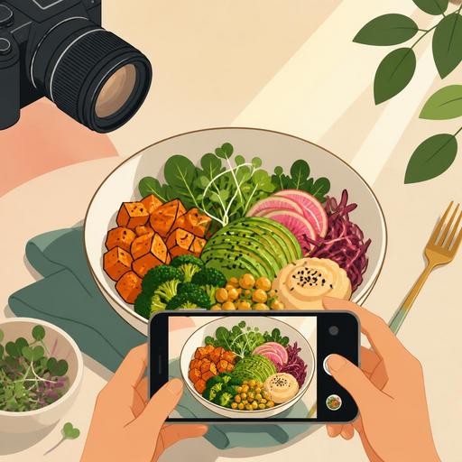
In restaurant menu photography, the goal is not just to get likes on social media. Especially on QR menus and online ordering screens, the photo's job is to convey what the product is within a few seconds. This need is even more important for vegan dishes; because some guests are curious about ingredients but also cautious at the same time. Some of the questions such as "what is this burger's patty based on?", "is this bowl hot or cold?", and "is this dessert light or rich?" can be answered with the right photo before even getting to the product description.
For example, in a vegan burger shot, the layers need to be shown: the bun, the patty, the greens, the sauce, the pickles, or the caramelized onions. If the burger is shot completely from above, the internal structure is lost. A frame shot from a slight front angle, on the other hand, conveys the product's fullness and the separation of ingredients more clearly. By contrast, for multi-component products such as a Buddha bowl or a breakfast plate, an overhead shot makes the arrangement more understandable.
This is where the menu-management side comes into play. Before shooting, you need to determine which products will be highlighted the most. Instead of doing the same level of production for every product, signature plates, high-margin products, new items, and the most-asked-about products should be prioritized. Being able to easily update product visuals in a digital menu infrastructure provides a big advantage with seasonal plate changes. Especially with vegan dishes whose presentation changes often, an old photo remaining on the menu makes expectation management harder.
How should the shoot-day operation be planned?
Successful menu photography often begins in the kitchen before the camera. With vegan dishes, freshness becomes visible very quickly. Avocado can darken, herbs can wilt, sauces can turn matte on the surface, and hot products can lose their sharpness due to steam. For this reason, the shoot-day flow should be planned.
The most efficient method is to order the products to be shot by category: cold bowls and salads, hot main courses, burgers and sandwiches, desserts, beverages. This way, you manage the lighting setup and the team flow more controllably. For each product, a "camera plate" should be prepared; that is, a version that is slightly more visually focused than the plate that goes out for service but still true to the actual recipe.
- Put the plate standard in writing before the shoot.
- Create a sample reference frame for garnish, sauce flow, and portion placement.
- Clearly inform the kitchen and service team which product will come out when.
- Name the photos the same day and archive them by category.
This archiving discipline speeds up content selection later for the QR menu, website, takeaway platforms, and social media. Matching image files to product names reduces time loss during menu updates.
Taking the photo isn't enough: How do you present it correctly on the digital menu?
A good vegan dish photo loses its impact if cropped incorrectly. A square format may be suitable for social media; but on digital menus that use a vertical or horizontal area, an important part of the product can be cut off. For this reason, it is wise to take multiple frames of each product during the shoot. A close-up frame showing texture works in a list view, while a wider, more explanatory frame can perform better on a product detail page.
Another important matter is the alignment of the image with the description text. If a cashew-based cream stands out in the photo, this should be stated in the description. If grilled vegetables are visible but the product description only says "vegetable bowl," a disconnect arises for the guest between photo and text. When the image, description, and product status are updated together with menu-management tools, this consistency is preserved.
Since seasonality is high in vegan restaurants, the color of some plates can change periodically. A summer tomato and a winter tomato don't look the same; basil oil, beet hummus, or squash puree can give different tones. For this reason, instead of photos that stay fixed for a long time on the digital menu, a logic of periodic revision is healthier. This way, the guest forms a stronger bond between what they see on the screen and the product they encounter at the table.
In conclusion, success in vegan menu photography comes not just from using a good camera; it comes from reading the light correctly, managing color saturation in a controlled way, simplifying the plate, and arranging the visuals to suit the digital menu experience. The right photo makes your product look appetizing without exaggeration; the right digital presentation turns that effort into an order.
To manage your menu visuals in a more organized, up-to-date, and guest-experience-aligned way, Restomas's digital menu infrastructure can simplify your work.