A Guide to Lighting and Color in Photography for a Vegan Restaurant Menu
Vegan restaurant menu photography is not just about making a plate look beautiful; it is the work of conveying the freshness of the ingredients, the texture of the dish, and your brand's approach in a single frame. Especially with plant-based dishes, color saturation and the use of light determine the difference between a customer saying "this dish really looks delicious" and saying "it looks over-processed." What is more, these photos are now a critical content asset not only for the printed menu, but also for the QR menu, online ordering screens, social media posts, and the pre-reservation browsing process.
In vegan cuisine, visual perception is more delicate because the customer often reads the plate's freshness and naturalness through its color. The green of avocado, the warm tones of roasted carrot, the matte cream color of hummus, the deep purple of beetroot, or the light tones of a coconut dessert all look appetizing in the right light. In the wrong light, however, these colors can be perceived as dirty, faded, or overly artificial. For this reason, a good shooting approach begins, before expensive equipment, with the right decisions.
Why is color saturation more critical for vegan dishes?
With meat-heavy dishes, the viewer often focuses on browning, texture, and the sense of portion. With vegan dishes, the decision-making process works more through color harmony, ingredient variety, and freshness signals. That is why greens looking yellowed in the photo, reds blowing out, or the overall tone shifting toward gray directly distorts perception.
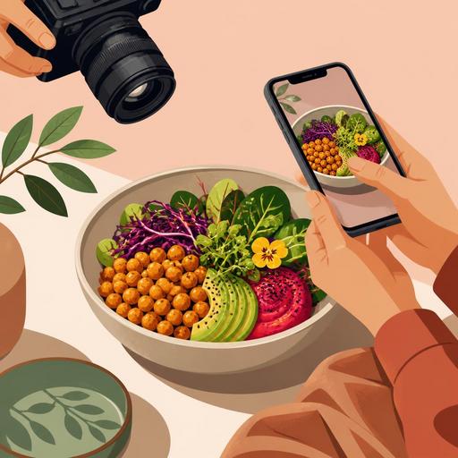
For example, if you are shooting a chickpea Buddha bowl, you should preserve the vibrancy of the cucumber while not making the beetroot look more dominant than it should. Otherwise, the plate looks not balanced but like a single-colored blotch. Similarly, in a vegan burger shoot, even though the brightness of the lettuce matters, using cold light that kills the warm tone of the bun lowers appetite. The goal is not to make the colors more striking than they really are; it is to make them look edible, fresh, and balanced.
Things to watch when managing color saturation
- Do not over-boost the greens: ingredients such as spinach, basil, and arugula lose their naturalness when they look neon.
- Be selective with red and purple tones: beetroot, red cabbage, and tomato sauce can easily become dominant on the sensor.
- Keep the plate's background simple: a colorful tablecloth or a patterned surface can drown out the natural color story of the vegan dish.
- Choose a hero color: not all colors should shout equally in every frame; for example, in a green-heavy plate, an orange garnish can serve as the accent.
Choosing the right light: soft light or hard light?
In vegan restaurant menu photography, the safest starting point is soft, directional natural light. Daylight coming from beside a window and diffused through a thin curtain both balances the color and brings out the texture in items such as hummus, bowls, salads, sandwiches, and desserts. Harsh midday sun, on the other hand, can create unwanted reflections especially on glossy sauces.
However, fully diffuse light is not right for every plate. For example, if you are shooting crispy-battered cauliflower or a grilled-vegetable panini, slightly side and somewhat more contrasty light strengthens the surface texture. The basic rule here is this: use softer light for products where you want to show freshness, and more controlled shadow for products where you want to show texture.
Practical lighting scenarios
- Salad and bowl shots: position close to a 45-degree angle to the window, softening the shadow with a light-colored reflector.
- Burger and sandwich shots: emphasizing the layers with light from the side, with low-distraction elements in the background.
- Dessert and coffee pairings: light from above and the side, with low contrast to show the creamy texture.
- Soups and hot dishes: slight backlight to make the steam visible, with weak fill from the front.
If you cannot always shoot at the same time of day, you will have a consistency problem on the menu. One plate looks yellowish, another bluish. This in turn lowers the perception of professionalism on the QR menu or online ordering screen. That is why the most efficient method for businesses is to set up a specific shooting corner and a repeatable lighting arrangement.
How do you maintain appetizing realism in menu photography?
The biggest mistake is making the dish unrecognizable while trying to make the photo "more beautiful" during editing. Vegan customers pay attention to authenticity, especially with plant-based dishes. If the sauce's color is different on screen than when the plate arrives at the table, a loss of trust occurs. For this reason, it is just as important for the photo to be aesthetic as it is for it to operationally create the right expectation.
Consider a concrete example: you are shooting pasta with a cashew-based Alfredo sauce. If you warm the white balance too much in the photo, the sauce turns yellow and creates a creamy but heavy impression. If you cool it too much, this time it creates a gray appearance that kills appetite. Similarly, in a falafel wrap shoot, boosting the contrast too far can make the flatbread look dry and stiff. In other words, every editing decision affects customer satisfaction as much as sales.
- Do color correction on a per-product basis: instead of applying a single filter to the whole menu, set adjustments by category.
- Do not distort the reality of the portion: a product that looks large in the photo but arrives small in service increases the risk of returns and complaints.
- Respect the texture: in items such as chia pudding, granola, hummus, and roasted vegetables, the sense of surface should not be lost.
- Stay consistent with the served form of the plate: garnishes added for the shoot that are absent in daily operations make the image misleading.
How should photo performance be considered on QR menus and digital screens?
A good menu photo must work not only in the studio, but also on a phone. This point is important for vegan restaurants because many customers look at the QR menu first and then order. On a small screen, photos that are too dark, overly detailed, or full of color clutter lose their effect. That is why the use case must also be taken into account when planning the shoot.
For example, a wide-frame brunch table may be impressive for social media; but it does not speed up the product decision on the QR menu. On the QR menu, single-product-focused, clear, simple, and close-up photos are more functional. Restaurant owners must establish two separate visual logics here: one for discovery and brand perception, the other to make the ordering decision easier.
An actionable checklist for digital use
- Separate the cover image from the product image: the hero shot is one thing, the product photo that drives an order is another.
- Simplify the frame: at first glance on a phone, it should be clear what the product is.
- Ensure category consistency: if all burgers are shot at a similar angle and all bowl items with similar lighting, the menu looks more professional.
- Plan for ease of updating: setting up an image-archive structure for seasonal vegan products speeds up menu management.
This is where the digital menu infrastructure comes in. When you can use your photos in a category-based, updatable, and per-product manageable way, visual quality turns into operational benefit. Especially when adding new products or changing a seasonal menu, keeping the visuals organized within the menu management system makes the team's job easier.
An actionable shooting plan for restaurant owners
Even if you do not constantly work with a professional agency, you can get good results. The important thing is to set up a system instead of shooting at random. First, identify the products on your menu that genuinely need a photo. Not every product needs a photo; give priority to products where the visual decision is critical, that will be tried for the first time, or that have a high margin.
- Choose the first 10 products: the most ordered ones, signature dishes, new vegan products.
- Fix the shooting time: if possible, do a batch shoot under the same lighting conditions.
- Create an angle guide: from above for bowls, 45 degrees for burgers, close-up for desserts, and so on.
- Put the service standard in writing: there should be no difference between the product in the photo and the product that comes out.
- Set up a file structure: archive by product name, category, date, and use case.
This approach provides not only aesthetic quality, but also reproducibility within the team. When the chef, the service team, and the digital menu manager share the same visual standard, the brand language becomes more consistent. The color variety that is the strong side of vegan cuisine can also turn into an advantage only through this consistency.
If you want to manage your menu photos in an organized, up-to-date way that is aligned with the digital ordering experience, Restomas's digital menu infrastructure built specifically for restaurants can help make this process more orderly.