Accessible QR Menu Design for U.S. Restaurants: Fonts, Contrast, and Backup Plans
ADA-minded QR menu design helps U.S. restaurants serve more guests smoothly while reducing confusion at the table, counter, and pickup area. A QR menu can speed updates, support direct online ordering, and reduce printing, but it should never become a barrier for guests who have low vision, limited dexterity, language needs, or simply do not want to use a smartphone. For restaurant operators, the goal is practical access: readable screens, clear menu structure, and a reliable staff backup plan when digital ordering is not the best fit.
Whether you run a neighborhood diner, a fast-casual salad shop, a sports bar, a hotel restaurant, or a food truck with a counter tablet, accessibility should be built into the workflow instead of treated as an afterthought. Accessibility rules can vary by situation, and operators should verify current federal, state, and local requirements with qualified advisors and official guidance. Operationally, however, there are clear steps every restaurant can take right now.
Start with screen readability, not just a scannable code
A guest does not experience your QR menu as a QR code. They experience the screen that opens after scanning. If that page uses tiny text, low-contrast colors, crowded layouts, or long blocks of menu copy, the ordering process slows down immediately.
For most restaurants, the safest move is to design for quick reading on a phone in real dining conditions: bright patio light, dim bar lighting, fingerprints on screens, and guests who may be splitting attention between conversation and ordering. A brunch cafe in Austin may have heavy window glare by 10 a.m. A sports bar in Chicago may have dark ambient lighting during game service. A hotel lobby restaurant may serve travelers who are tired and in a rush. In each case, readability matters more than visual flair.
- Use larger body text: Avoid tiny font sizes that force guests to pinch and zoom before they can read dish names or modifiers.
- Choose strong color contrast: Dark text on a light background is usually the easiest starting point. Avoid light gray text, busy photo backgrounds, and low-contrast accent colors for important details.
- Keep line lengths short: Dense paragraphs make menus harder to scan. Break content into short sections and concise item descriptions.
- Make tap targets generous: Buttons for categories, add-ons, and checkout should be easy to tap without precision finger movement.
- Do not rely on color alone: If spicy items, sold-out items, or dietary tags are shown only by color, some guests may miss the meaning.
A good test is simple: ask a manager to stand near the front window at lunch, open the menu on an average smartphone, and complete an order one-handed in under a minute. If they struggle, guests will too.
Use plain menu language and predictable structure
Accessible design is also about cognitive ease. Guests should not have to decode the menu architecture. If your burger build starts with protein in one section, bun choice in another, and sides in a third hidden screen, completion rates can drop and staff will spend more time answering the same questions.
Plain language does not mean boring copy. It means the menu is easy to understand on first read. A fast-casual bowl concept in Denver can still describe flavor clearly while keeping steps obvious: choose base, choose protein, choose sauce, choose extras. A diner in New Jersey can list breakfast combos with simple headings and clear included sides. A bar with late-night food can separate shareables, mains, and add-ons so guests do not hunt through the full menu while tabs are open.
- Lead with the item name. Put the recognizable dish first, then a short description.
- Show price near the item. Do not make guests open extra screens just to see the check impact.
- Label modifiers clearly. Use direct wording such as add bacon, choose dressing, or select temperature.
- Mark unavailable items visibly. Hide or label sold-out dishes so guests do not waste time building orders that cannot be fulfilled.
- Keep allergy and dietary notes easy to find. Staff should still be ready to answer questions, and operators should verify applicable local and federal guidance for disclosures.
If you serve multilingual communities, consider offering additional language versions where operationally appropriate. In parts of California, Texas, Florida, or New York, a second language option may reduce friction for both guests and staff. Keep translations simple and professionally reviewed where possible so dish meaning stays accurate.
Build a staff backup plan for guests who cannot or do not want to scan
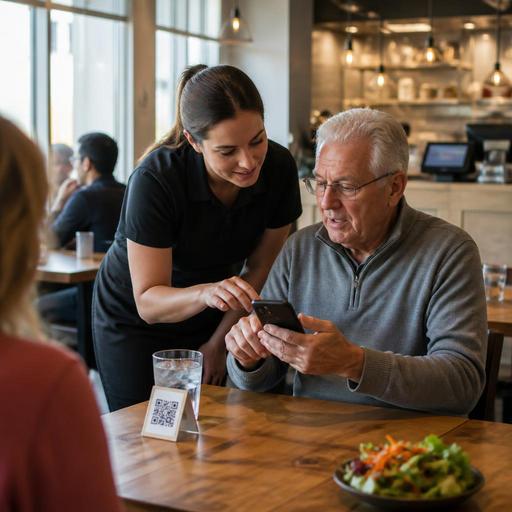
The most important ADA-minded move is having a human backup plan. Not every guest will scan. Some may have visual impairments. Some may not use smartphones. Some may have dead batteries, limited data service, or difficulty navigating mobile checkout. Others may simply prefer a printed menu and a server taking the order.
That means front-of-house teams need a standard script and a standard process. At a minimum, hosts, servers, bartenders, and counter staff should know exactly what to do when a guest says, “I can’t read this on my phone,” or “Can you just tell me what comes with the chicken sandwich?”
- Keep printed menus available: Even a limited, large-print version can help in dining rooms, hotel restaurants, and airport concession settings.
- Train staff to offer help proactively: If a guest hesitates with the QR code, staff should offer a menu or read options without making the interaction awkward.
- Provide table-side ordering backup: Servers should be able to enter the order in the POS if the guest cannot complete mobile ordering.
- Support payment alternatives: If QR ordering leads to digital payment, make sure guests can still pay at the terminal, with a server, or at the counter when needed.
- Document the workflow: Add accessibility backup steps to opening checklists and new-hire training.
This is especially important in U.S. service models where tipping workflows vary. In full-service restaurants, guests may prefer a server-managed check and tip line rather than a phone checkout flow. In fast-casual and QSR settings, a counter team member may need to move the order from QR browsing to assisted ordering without delaying the line. Operators should also make sure tip prompts, service charges, and sales tax presentation are clear and consistent, and verify local requirements with qualified advisors.
Match QR access to the realities of your service model
Accessibility decisions should fit the venue. A food truck at a festival may use a QR code for menu browsing while still taking spoken orders at the window. A suburban pizza shop may use QR reordering links for direct takeout while maintaining a pickup shelf and curbside pickup instructions by phone. A multi-location fast-casual brand may standardize font, contrast, and category order across every store so guests get the same experience in Phoenix and Philadelphia.
Think through the full guest journey:
- Dine-in: Can a guest browse, ask questions, and order without getting stuck on their phone?
- Takeout: Are pickup times, utensil choices, and order names easy to review?
- Curbside pickup: Can guests find arrival instructions without reading tiny text in the parking lot?
- Delivery and direct ordering: Is the mobile menu easier to use than third-party delivery apps for repeat guests?
- Large venues: In stadiums, airports, and hotel properties, can staff redirect guests smoothly if Wi-Fi, signal, or device issues interrupt ordering?
For chains subject to menu labeling or other disclosure obligations, digital menus should be reviewed carefully so required information appears where it needs to appear. Because federal, state, and local rules can change and may apply differently by concept, size, and location type, operators should confirm details with official guidance and counsel.
Audit your QR menu like an operations tool
Do not treat the QR menu as a one-time design project. Review it the same way you review prep sheets, labor schedules, and KDS timing. If guests abandon carts, ask where the friction starts. If servers keep explaining the same combo structure, simplify that screen. If your cafe changes seasonal drinks weekly, make sure the digital menu updates instantly and remains readable after each change.
A practical monthly audit can include one manager, one server, and one guest-perspective test on different phones. Check loading speed, readability, modifier flow, payment steps, and backup options. Confirm that disabled or 86ed items are handled cleanly. Make sure the online menu matches the in-house POS and kitchen display system routing so staff do not have to fix preventable errors during a rush.
When QR menus are designed accessibly, they do more than look modern. They reduce table friction, support staff, and make ordering easier for more people in more real-world conditions. Restomas helps operators manage digital menus, ordering flows, and service consistency in a way that supports both guest convenience and practical restaurant operations.