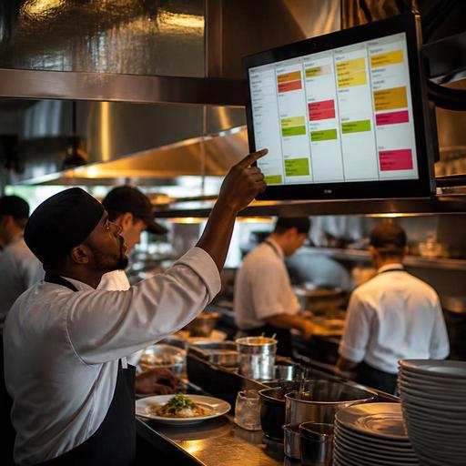
Color-Coded Kitchen Order Tracking to Reduce Restaurant Errors
Color-coded kitchen order tracking can solve a problem that many restaurants accept as normal: tickets get missed, modifiers are overlooked, and dishes leave the pass incomplete or late. In busy service, mistakes rarely come from one big failure. They usually come from small gaps in visibility. When cooks, expediters, servers, and cashiers do not share the same visual language, the kitchen has to rely on memory, shouting, or repeated checking. A simple color system creates faster recognition and clearer priorities without adding more noise.
For restaurant owners and operators, the value is practical. A well-designed color workflow helps teams spot urgency, identify order channels, separate dine-in from delivery, and catch special requests before food leaves the kitchen. It is not just a design choice on a screen. It is an operations tool that makes decision-making easier during rush periods.
Why kitchens make repeatable order mistakes
Most recurring order errors are workflow errors, not talent problems. A strong line cook can still miss a modifier if the ticket format is crowded or if urgent orders look exactly the same as standard ones. A skilled server can still pick up the wrong bag if all completed orders appear identical at handoff. The issue is often that the system does not help the team notice what matters first.
Common examples include allergy notes buried in long modifier lists, pickup orders mixed with dine-in tickets, and delayed items that should have been escalated earlier. In many restaurants, staff members create their own workarounds. One cook circles tickets with a marker. Another stacks receipts in a certain direction. An expediter shouts out delivery deadlines. These habits may work for individuals, but they do not scale well across shifts, new hires, or multi-station kitchens.
Color creates a shared shortcut. Instead of reading every line in full before understanding the context, staff can recognize key meaning at a glance. That shortens reaction time and reduces the chance that an important detail is noticed too late.
What color coding should represent in a real kitchen
The biggest mistake in setting up a color system is using colors for too many meanings at once. If red means urgent, allergy, and delivery delay depending on the screen, it stops being useful. Each color should have one clear operational purpose that staff can learn quickly and apply consistently.
In practice, restaurants usually get the best results when color coding reflects one or more of these areas:
- Order status: new, in progress, ready for pickup, completed
- Service channel: dine-in, takeaway, delivery, QR table order
- Priority level: standard, urgent, delayed, needs attention
- Risk flags: allergy note, no-contact delivery, VIP table, remake
- Station ownership: grill, salad, dessert, bar, packing
For example, a cafe may use blue for new orders, yellow for drinks waiting on food, green for ready handoff, and red only for issues that need intervention. A full-service restaurant may color delivery orders differently from dine-in so the pass knows immediately which plates can wait for table synchronization and which bags have a courier deadline. A quick-service concept may use color to show whether an order came from the counter, kiosk, or online channel so packaging and confirmation steps are not missed.
The point is not to add decoration. The point is to reduce interpretation time.
How to design a color workflow that staff can actually use
Good color-coded order tracking starts with a simple map of your current mistakes. Before changing anything, review the last few weeks of service and identify patterns. Are wrong items leaving the kitchen? Are modifiers being missed? Are completed orders sitting too long before handoff? Are delivery orders falling behind because they are not visible early enough? Your color system should address real friction, not imagined preferences.
Then build the workflow around the moments where staff need instant clarity. A practical rollout often looks like this:
- Choose three to five meanings only. Too many colors create confusion. Start small and expand only if the team consistently uses the first version correctly.
- Assign one meaning per color. Keep the logic stable across kitchen screens, order management views, and pickup areas.
- Use strong contrast. Kitchen environments are fast, bright, hot, and full of motion. Subtle shades are easy to miss.
- Back up color with text or icon logic in the system. This supports accessibility and prevents errors if a screen is viewed from a distance or at an angle.
- Train with real service examples. Show staff what a delayed delivery order looks like, what an allergy alert looks like, and what action each color should trigger.
- Review after one week. Ask where staff still hesitate and which colors create false urgency.
Suppose a burger restaurant regularly misses modifier details on online orders. Instead of making every modifier a different color, the restaurant could highlight only high-risk notes such as no onions, gluten-free bun, or allergy requests in a dedicated alert color. That keeps the emphasis where mistakes are most costly. In another example, a brunch cafe with heavy takeaway volume could mark pickup orders in one color and table-service orders in another, helping runners avoid carrying packaging to the wrong area.
Where color-coded tracking improves guest experience
Guests do not usually see the kitchen screen, but they feel its effects. A better visual order flow improves accuracy, pacing, and confidence across the service chain. When the kitchen recognizes priorities earlier, the dining room experiences fewer awkward corrections and less last-minute scrambling.
Here are some direct guest-facing benefits:
- Fewer missing modifiers: Guests are more likely to receive the dish they requested the first time.
- Cleaner allergy handling: High-risk orders stand out sooner and are less likely to be treated like standard tickets.
- Better timing: Courses, drinks, and takeaway orders move with clearer coordination.
- More reliable pickup and delivery: Completed orders are easier to identify, bag, and hand off correctly.
- Less visible stress: Staff spend less time asking repeated status questions during peak periods.
This matters especially in multi-channel operations where table orders, QR orders, phone orders, and delivery platform orders hit the same kitchen. Without a clear visual structure, one channel tends to dominate attention while another quietly slips. Color helps rebalance visibility so the kitchen responds based on operational priority rather than whoever is shouting loudest.
How digital tools make color tracking consistent across shifts
Paper tickets can be marked by hand, but digital systems make color-coded order tracking far more consistent. A digital workflow can apply the same visual rules automatically every time an order enters the system, changes status, or reaches a delay threshold. That reduces dependence on individual memory and keeps standards stable across lunch, dinner, weekends, and new staff onboarding.
For example, if a restaurant uses digital ordering and kitchen display workflows, a QR table order can appear with a specific channel color the moment it is sent. If the order contains an allergy note, that alert can stand out immediately rather than waiting for someone to notice it in a long ticket. If a takeaway order sits too long without moving to ready status, the system can shift its visual state so the team knows it needs attention.
This is where restaurant platforms can support operations in a practical way. Tools like Restomas help restaurants centralize digital orders, menu structures, and kitchen-facing workflows so visual logic is easier to maintain. When menu modifiers, order channels, and service states are connected in one system, color tracking becomes more than a screen preference. It becomes part of how the operation communicates.
To keep the system effective, owners should review it regularly. Seasonal menu changes, new packaging steps, additional delivery channels, or a revised station layout can all affect which color signals matter most. The best setups are not static. They are simple, trainable, and adjusted when the operation changes.
If your restaurant is refining digital order flow, Restomas can help you organize menus, channels, and kitchen visibility in a way that supports clearer service.