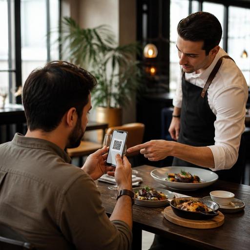
How Chef's Choice Menu Sections Increase High-Margin Orders
Chef's choice menu sections can do much more than showcase a restaurant's favorites. When used intentionally, they help guests decide faster, highlight dishes with strong contribution margins, and create a more confident ordering experience. For restaurant owners and operators, the goal is not to push guests into the most expensive item. It is to guide them toward dishes that feel special, fit the brand, and support profitable service.
Many menus list items in a flat way, giving every dish the same visual weight. That approach often leaves guests scanning too long, defaulting to familiar low-margin items, or asking staff for recommendations during busy periods. A chef's choice section solves this by adding structure. It tells guests, start here. It also gives the kitchen and front-of-house team a shared shortlist of dishes worth promoting.
Done well, this strategy improves both guest satisfaction and operational efficiency. Done poorly, it feels manipulative or confusing. The difference comes down to menu selection, wording, placement, and how well the recommendations match actual service realities.
What a chef's choice section should really do
A chef's choice section is not just a random list of popular dishes. It should be a curated group of items that meet several goals at the same time:
- They represent the restaurant's identity clearly.
- They are easy for staff to describe and recommend.
- They have dependable execution during peak service.
- They contribute healthy margin without creating kitchen strain.
- They reduce decision fatigue for guests.
For example, a bistro might feature a braised short rib, a seasonal risotto, and a signature dessert in its chef's choice area. These dishes are not there simply because the chef likes them. They belong there because they tell the story of the menu, use ingredients efficiently, and can be explained in a sentence by any server.
In a cafe, the same logic might apply to a house breakfast plate, a premium sandwich, and a specialty beverage pairing. In a casual restaurant, it could be a combo meal, a shareable starter, and a best-performing grill item. The format changes, but the purpose stays the same: guide guests toward choices that are both attractive and operationally smart.
How to choose high-value items without frustrating guests
The best high-value items are not always the highest-priced dishes. A truly effective chef's choice section includes items that feel worth ordering. Guests respond to value, clarity, and trust more than price alone.
When selecting items, review each dish through four practical filters:
- Margin quality: Does the item contribute meaningfully after ingredient and labor costs?
- Execution reliability: Can the kitchen produce it consistently during busy hours?
- Brand fit: Does it reflect what your restaurant wants to be known for?
- Guest appeal: Is the dish understandable and desirable without a long explanation?
Suppose a steak dish is profitable but causes ticket delays, inconsistent doneness issues, and heavy grill congestion on weekends. It may be high value on paper but weak in practice. Meanwhile, a roasted chicken dish with a strong sauce, appealing plating, and stable prep may deliver better overall value because it sells smoothly and protects service flow.
Another example is beverage pairing. If your chef's choice section includes a featured dish and a clearly matched drink, you increase average check in a natural way. A seafood plate paired with a crisp white wine or a house-made lemonade gives guests a complete decision, not an upsell script.
It also helps to include a mix of comfort and discovery. If every recommended item feels unfamiliar, some guests will ignore the section. If every item feels too safe, the section loses distinction. A balanced set of recommendations invites trust while still steering demand.
Menu design and wording that influence decisions naturally
Placement matters. A chef's choice section works best when it appears early enough to shape decisions before guests settle into scanning habits. On a printed menu, that may be a highlighted panel near the top of the main food categories. On a digital menu or QR menu, it may be a dedicated section visible before the full list of categories.
The wording should be confident but not exaggerated. Avoid empty labels like must try if every second item is also labeled special. Instead, explain why the dish is recommended.
Strong examples include:
- Chef's choice: Slow-braised lamb with rosemary jus - rich, tender, and prepared for long flavor development.
- Tonight's recommended pasta - made for guests who want a lighter main with seasonal vegetables.
- House favorite dessert - our pastry team's warm tart served best with coffee after dinner.
This kind of phrasing does three things. It gives the dish authority, sets an expectation, and reduces uncertainty. Guests are more likely to choose a recommended item when they understand what makes it special.
Keep the section focused. Three to five items is often enough. Too many recommendations stop feeling like recommendations. Visual hierarchy matters too. Use spacing, concise names, and short descriptions rather than long paragraphs. If you run digital menus, photos can help, but only when they are consistent and realistic. One strong image can guide attention better than a gallery of uneven pictures.
How staff and digital menus should work together
A chef's choice strategy succeeds when the menu and the team reinforce each other. If the digital menu highlights one set of dishes but servers verbally recommend something else, guests receive mixed signals.
Start by giving staff simple recommendation language. Instead of asking servers to improvise, provide short prompts tied to guest needs:
- For first-time guests: If you want to start with what represents us best, the chef's choice section is a great place to begin.
- For indecisive tables: The lamb and the seasonal pasta are our easiest recommendations tonight.
- For faster lunch turns: If you need something satisfying without a long wait, the chef's sandwich and soup combo is our recommended choice.
Digital menu tools make this more consistent. You can feature chef's picks at the top, adjust them by daypart, and remove items that are unavailable or not ideal for current kitchen conditions. That matters because a recommendation only works if the item is actually ready to sell.
For example, a brunch venue might promote a chef's breakfast board in the morning, then switch to a lunch bowl and signature iced drink in the afternoon. A restaurant with QR menus can test whether guests respond better to a chef's choice section named Kitchen Favorites, Recommended Tonight, or Start Here. Small wording changes can improve clarity without changing the menu itself.
Operators should also monitor whether featured items create bottlenecks. If one recommended dish slows the pass or depends on a single station, it may need to be replaced by a more service-friendly option. The best recommendation is one that sells well and fits the reality of the shift.
A practical rollout plan for restaurant owners
If you want to implement chef's choice sections effectively, keep the process operational, not decorative.
- Choose three to five items based on margin, execution, and brand relevance.
- Write one-sentence descriptions that explain why each item is recommended.
- Place the section prominently in printed and digital menus.
- Train staff on short recommendation scripts for different guest situations.
- Review weekly which featured items actually sell smoothly and profitably.
- Rotate carefully based on season, daypart, and kitchen capacity.
One practical approach is to test the section for two weeks with a limited set of items. Watch ordering patterns, prep pressure, and guest questions. If guests still ask what to order, the section may be unclear. If servers ignore it, the training may be too vague. If the kitchen dislikes it, the choices may not match production reality.
The strongest chef's choice sections feel helpful, not promotional. They reduce friction for guests and create focus for the team. In that way, they become more than a menu design element. They become a simple decision system that supports better ordering behavior.
Restaurants using digital menu management can refine this process even faster by updating featured sections in real time, aligning recommendations with stock and service flow, and keeping the guest journey consistent across dine-in and QR experiences. Restomas can support that kind of flexible menu presentation as part of a more organized digital restaurant operation.