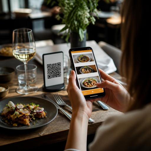
How QR Menu Color Psychology Can Improve Restaurant Conversions
QR menu color psychology is not about manipulating guests or chasing design trends. It is about making digital menus easier to scan, easier to trust, and easier to order from. For restaurant owners, the right color choices can guide attention toward bestsellers, seasonal dishes, add-ons, and high-margin items without making the menu feel pushy. In a QR menu, where guests often decide quickly on a phone screen, color becomes part of service design as much as branding.
A printed menu gives guests a fixed layout and a physical object to hold. A QR menu lives on a smaller screen, often in different lighting conditions, with varying device quality and screen brightness. That means color decisions need to support readability, appetite appeal, and fast decision-making. If the palette is too dark, too bright, or too inconsistent, guests may miss categories, skip modifiers, or abandon the process. If it is clear and intentional, the menu feels organized and professional.
Why color matters more in a QR menu than in a printed menu
In digital menu management, color does several jobs at once. It supports brand identity, creates visual hierarchy, and helps guests understand what to do next. On a mobile menu, guests do not read every line. They scan, compare, and tap. Good color use helps them move smoothly from category to item to customization to checkout.
For example, a cafe may use a soft neutral background with dark text for readability, a warm accent color for signature drinks, and a distinct but limited highlight color for add-ons like oat milk, extra shots, or pastry bundles. A burger concept might use stronger contrast and a bolder accent to make combo upgrades obvious. In both cases, color is doing operational work: reducing hesitation and making choices clearer.
Color also affects trust. If allergy notes, spice indicators, sold-out labels, and call-to-action buttons all use unrelated colors, guests can feel uncertain. When colors are assigned consistently, the menu feels easier to understand. That can reduce staff interruptions because fewer guests need help finding modifiers, dietary notes, or featured items.
What different color families can signal in food and menu design
Color meanings are never universal, and context matters. Still, some patterns are useful in restaurant menu design.
- Red and warm orange often create energy, urgency, and appetite cues. They can work well for promotions, chef specials, limited-time items, or action buttons such as Add to Order. Overuse, however, can make the screen feel stressful.
- Green often signals freshness, plant-based options, organic ingredients, salads, herbs, or sustainability-focused items. It is useful when you want to make healthy choices easy to find.
- Yellow and amber can suggest warmth, comfort, and quick attention. These tones may work for breakfast sections, bakery items, or house recommendations, but they need strong contrast to remain readable on mobile screens.
- Blue can communicate cleanliness, trust, and calm, but in food contexts it is usually better as a supporting color than the main sales color. It often works well for seafood brands, beverage sections, or interface elements that need a clean feel.
- Black, charcoal, and deep neutrals can create a premium impression, especially for steakhouses, cocktail bars, and upscale dining. The risk is readability if the text contrast is too low.
- White and light neutrals help menus feel open, modern, and easy to scan. They are especially effective when menus have many categories or many modifiers.
The practical lesson is simple: use color to reinforce the story of the food and the pace of the ordering experience. A dessert-heavy concept can lean into warm indulgent accents. A salad bar or farm-to-table venue may benefit from greens and earthy neutrals. A sushi restaurant may combine restrained neutrals with one accent color to keep the menu calm and premium.
How to use color to highlight profitable items without overwhelming guests
Many restaurants want guests to notice signature dishes, bundles, and upsells. The mistake is trying to highlight everything. If every tile, badge, and button demands attention, nothing stands out.
A better approach is to define a simple color hierarchy:
- Base colors for background, body text, and standard category structure.
- Primary accent color for actions and your most important highlights.
- Secondary accent color for supporting labels such as spicy, vegetarian, new, or seasonal.
Imagine a pizza restaurant with a QR menu. The regular item cards stay neutral and clean. Best-value bundles get a warm accent badge. Premium toppings use a smaller secondary color label. The checkout button stays in the primary accent color across the entire menu. This creates consistency. Guests learn quickly what matters and what to tap.
Another example is a brunch cafe trying to increase average ticket size. Instead of coloring every breakfast item differently, it can use one accent color only for profitable extras such as avocado add-ons, fresh juice pairings, or dessert upgrades. This keeps the menu readable while still directing attention where it supports revenue.
Menu management tools make this easier because you can test changes by category, daypart, or campaign. If you run a weekend brunch menu, a holiday drinks menu, or a limited summer menu, the color treatment can support those offers without rebuilding the whole experience.
Common QR menu color mistakes that hurt guest experience
Restaurant owners often focus on attractive colors before checking whether guests can actually use the menu easily. In practice, usability comes first.
- Low contrast text is one of the most common problems. Light gray text on beige backgrounds may look elegant in a mockup but can be difficult to read in real dining-room lighting.
- Too many highlight colors create confusion. If promotions, allergens, vegan items, sold-out items, and CTA buttons all use different bright colors, the interface becomes noisy.
- Using color alone to convey meaning can exclude some users. Pair colors with text labels such as spicy, contains nuts, or sold out.
- Dark mode styling without testing can make food photography, descriptions, and buttons harder to distinguish, especially on older phones.
- Ignoring brand fit can weaken trust. A premium wine bar and a family burger restaurant should not use the same visual energy.
Operationally, these mistakes can lead to slower table turns, more questions for staff, missed upsells, and order errors. A digital menu is not just a design asset. It is part of the service workflow.
A practical color strategy restaurant owners can apply this month
If you want to improve your QR menu without a full redesign, start with a focused review.
- Audit your current menu on multiple phones. Check readability in bright daylight and dim evening lighting.
- Identify three business priorities. For example: promote signature dishes, increase add-ons, and reduce confusion in modifiers.
- Limit the palette. Keep one base system and one or two accent colors only.
- Assign clear meaning to each color. For example, green for plant-based, amber for featured items, red for spicy markers or urgent stock messages.
- Test one category first. Try changes in desserts, drinks, or lunch specials before updating the full menu.
- Watch guest and staff behavior. Are guests finding options faster? Are servers answering fewer repetitive questions? Are add-ons more visible?
This is where restaurant digitization becomes practical. A flexible QR menu system lets operators update categories, item visibility, seasonal sections, and visual emphasis quickly. Instead of treating menu design as a one-time project, you can manage it as an ongoing operational tool. That matters when items sell out, promotions change, or you want to feature different dishes by daypart.
The strongest QR menus combine psychology with clarity. They do not use color for decoration alone. They use it to support appetite, readability, trust, and faster decisions. For restaurants, that can mean smoother service, better visibility for profitable items, and a more polished guest experience from the first scan.
With Restomas, restaurants can manage QR menu updates, featured items, and digital guest journeys in a way that keeps design choices practical and easy to maintain.