How to Build Restaurant Menu Pages That Turn Local Search Into Orders
If your restaurant menu page gets traffic from Google but does not produce more checks, takeout orders, or reservations, the problem is usually not visibility alone. Restaurant menu pages that convert local search visitors need to answer guest questions fast, match the way Americans order, and remove friction between discovery and checkout. Whether you run a neighborhood diner, a fast-casual salad shop, a food truck with rotating stops, or a multi-location pizza brand, your menu page should help a nearby guest decide what to order right now.
In the U.S., that means designing for practical behaviors: guests compare prices before sales tax, look for pickup and delivery choices, check whether they can customize an order, and want to know if a place is family-friendly, quick for lunch, or suitable for a group tab after work. A strong menu page also supports operations behind the scenes by syncing with your POS, routing orders to a kitchen display system, and reducing calls that tie up staff during rush periods.
Start with local search intent, not just menu design
Many operators treat the menu page like a PDF replacement. That misses the point. A local search visitor often lands on your site after searching for terms like best burgers near me, gluten-free brunch in Austin, late-night tacos Chicago, or takeout sushi downtown Seattle. Your menu page should reflect those real intents without sounding stuffed with keywords.
For example, a suburban breakfast cafe outside Atlanta can organize its menu page around guest priorities: all-day breakfast, kids options, coffee drinks, and online waitlist or reservation links. A fast-casual bowl concept in Denver may want visitors to see base choices, protein add-ons, and pickup timing before they ever scroll to sides. A sports bar near a stadium may need game-day bundles, wing flavors, and quick links to curbside pickup because guests are ordering on the way to the venue.
Operationally, focus on these basics:
- Use clear category names such as brunch, sandwiches, family meals, cocktails, kids menu, and catering.
- Lead with high-intent items that local guests commonly search for or reorder.
- Show location-specific availability if hours, alcohol service, or item selection vary by store.
- Avoid image-only PDFs that are hard to read on phones and weak for search visibility.
For chains and franchise groups, this is especially important. If each location has different pricing, service charges, or menu availability, the menu page should reflect the guest’s selected store. Guests do not like discovering at checkout that a combo meal, happy hour item, or dessert is unavailable at their location.
Make the page easy to scan on a phone in under 30 seconds
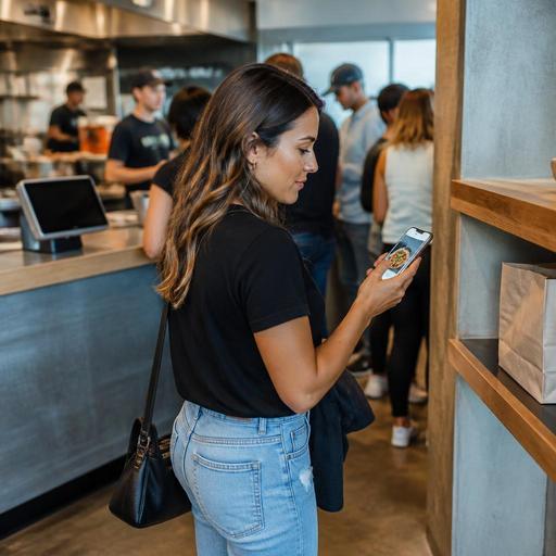
Most local search traffic reaches restaurant sites on mobile devices. Guests may be standing on a sidewalk, in a parked car, at an office desk planning lunch, or comparing places while a group debates dinner. Your menu page should help them make a decision quickly.
A good rule is to assume the guest wants three things immediately: what do you serve, how much does it cost, and how do I order? Put those answers near the top. For a quick-service restaurant, that might mean showing featured categories, direct online ordering, and pickup options first. For a full-service bistro, it may mean lunch menu, dinner menu, reservations, and a note about patio seating or weekday specials.
Concrete examples from U.S. operations:
- A Texas barbecue spot can place brisket by the pound, sandwich combos, family packs, and sold-out notices in a simple mobile layout.
- A New York neighborhood pizzeria can highlight whole pies, slices, lunch specials, and a direct order button above third-party delivery links.
- An airport concession can emphasize grab-and-go items, combo speed, and limited-time breakfast hours for travelers.
- A hotel restaurant can separate in-room dining, breakfast buffet details, and lobby bar offerings so guests do not have to guess.
Also think about readability. Use short item names, concise descriptions, and obvious modifiers. If guests can add avocado, choose a side, select spice level, or swap a bun, those choices should be simple to tap. If your digital menu supports QR ordering in-house, the same logic matters at the table: fewer confusing steps mean fewer abandoned orders and fewer server interruptions.
Reduce conversion friction between browsing and ordering
A menu page should not stop at presentation. It should guide the guest to the next action. Depending on your concept, that action may be direct online ordering, a reservation, joining a waitlist, calling for catering, or starting a bar tab in person. The key is that the path should be obvious.
Here are practical ways to reduce friction:
- Offer direct ordering clearly for takeout and curbside pickup, especially if delivery apps are also listed.
- Show pickup instructions such as pickup shelf location, curbside check-in flow, or where food truck guests should collect orders.
- Keep modifiers accurate so guests do not place impossible customizations that slow the kitchen.
- Connect menus to real-time item availability when possible, especially for bakeries, seafood specials, barbecue, and limited-run desserts.
- Separate delivery from direct ordering so guests understand whether fees, menu prices, and timing differ.
This is where operations and marketing meet. If your POS, online ordering, and kitchen workflows are disconnected, the menu page may promise things your team cannot execute smoothly. A pickup shelf only works if order names, timing, and packaging procedures are consistent. Curbside pickup only works if the guest knows where to park and how to alert staff. A bar with QR ordering can increase convenience, but the menu still needs clear prompts for opening tabs, adding rounds, and tipping flows that align with your payment setup.
Be careful with pricing language as well. In the U.S., guests may react differently to listed menu prices, automatic service charges, delivery fees, and sales tax added at checkout. Present charges clearly and verify current legal requirements with your accountant, attorney, payroll provider, or official state and local guidance before changing disclosures or workflows.
Build trust with clarity, accessibility, and useful details
Conversion is not only about speed. It is also about confidence. Guests are more likely to order when the menu page feels current, transparent, and easy to use.
Start with item detail quality. Describe signature dishes in plain language. A California fast-casual Mexican concept should not make guests guess whether a bowl includes rice and beans or whether salsa choices are extra. A diner in Ohio should make clear whether breakfast is served all day. A seafood restaurant in Florida should distinguish market-price specials from standard entrees. If alcohol appears, verify state and local rules for online display, ordering, and fulfillment.
Accessibility matters too. An ADA-minded approach is operationally smart because it helps more guests complete orders independently. Use readable text, logical category structure, and pages that work well with mobile assistive technology. Avoid relying only on tiny images or color cues to communicate important information. If you publish allergen, nutrition, or ingredient details, keep them updated and verify the right format for your business model. Larger chains may also need to review FDA menu labeling rules and location-level consistency with qualified advisors or official guidance.
Trust also comes from freshness. Nothing hurts conversion like expired specials, incorrect hours, or a dead reservation link. Assign ownership. Someone on the management team should know who updates holiday menus, 86s items, changes brunch hours, and reviews direct order links weekly.
Use menu pages as an operations tool, not just a marketing asset
The best menu pages support the whole restaurant, not just SEO. They can reduce phone interruptions, improve order accuracy, and help steer demand toward more profitable channels.
For example, a five-unit burger group can use location-based menu pages to route guests to the nearest store, show store-specific pricing, and promote direct pickup instead of sending every customer to delivery marketplaces. A coffee shop with heavy morning traffic can push preorder pickup windows to smooth the line. A food truck can update a limited menu for each event and link directly to mobile ordering. A stadium or concession operator can simplify high-volume categories so guests move from search to purchase with fewer taps.
Use your menu page to answer the questions staff hear every day:
- Do you have gluten-free or vegetarian options?
- Can I order ahead for pickup?
- Where do I park for curbside pickup?
- Are family packs available today?
- Which location has this item?
- Do you take reservations or walk-ins only?
When menu pages answer those questions clearly, servers, hosts, and cashiers spend less time repeating basics and more time helping guests. That matters in lean labor environments where managers are balancing scheduling, training, and service recovery at the same time.
Strong menu pages do not need flashy design. They need accurate categories, mobile-first structure, clear ordering paths, store-level detail, and reliable integration with your restaurant systems. Restomas helps operators connect digital menus, QR ordering, online ordering, and service workflows so menu pages can work harder for both guests and staff.