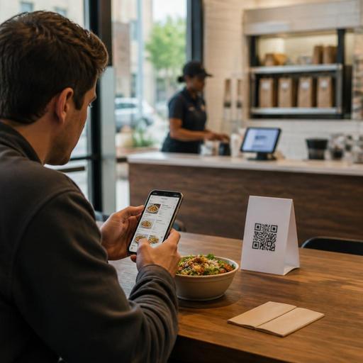
QR Menu Design for U.S. Restaurants: Table Tents That Build Ordering Confidence
QR menu design for U.S. restaurants works best when it does more than replace a printed menu. A well-planned QR experience helps guests feel confident about what to order, how to customize, and how to pay, while reducing back-and-forth for servers and cashiers. Whether you run a neighborhood diner, a fast-casual salad concept, a hotel restaurant, or a food truck with outdoor seating, the goal is the same: make digital ordering simple, clear, and trustworthy.
Many operators learned that putting a code on the table is the easy part. The harder part is designing table tents, menu structure, item detail, and service flow so guests are not left guessing. In U.S. restaurants, that means thinking through tipping prompts, sales tax visibility, direct online ordering, delivery app expectations, ADA-minded access, and location-specific operations. The practical steps below can help you build a QR menu flow that feels familiar to American diners and supports staff during busy service.
Start with the table tent, not just the QR code
Guests decide whether to scan in seconds. If the table tent is confusing, too small, or missing context, some guests will wait for a server or ask for a printed menu. That slows service and reduces adoption. The table tent should answer three questions immediately: what happens after scanning, whether guests can order and pay, and how to get help if they prefer a traditional interaction.
- State the next step clearly: Use simple wording such as scan to view the menu, order, or pay your check.
- Set expectations: If guests still order through a server, say so. If they can reorder drinks from the table, mention that too.
- Offer a backup path: Train staff to provide a printed menu or verbal guidance when needed.
- Keep placement practical: In a diner booth, tent cards should be visible but not in the way of condiments. In a sports bar, they should stay readable in lower light.
For example, a suburban brunch cafe may use table tents that say guests can scan to browse photos and allergy notes, but checks are still closed with the server. A fast-casual burger chain may instead direct guests to scan, order, pay, and pick up from a runner station. The wording should match the real service model, not an idealized one.
Design the QR menu for confidence, not just speed
Ordering confidence comes from clarity. Guests should understand item names, sizes, add-ons, and pricing without hunting around. If your digital menu is too clever, too visual, or poorly organized, people hesitate. Hesitation means abandoned orders, line questions, and slower table turns.
Use familiar U.S. menu structure
Most U.S. guests expect categories such as starters, salads, sandwiches, entrees, sides, desserts, beer, wine, and cocktails when those apply. A coffee shop may use hot coffee, iced drinks, espresso, breakfast, and bakery. A food truck may use signatures, combos, sides, and drinks. Keep categories short and obvious.
Show customization in a controlled way
Customization is where digital menus either shine or create confusion. A build-your-own bowl concept should show a clear step-by-step flow: base, protein, toppings, sauce, and extras. A diner offering eggs with side choices should make substitution rules easy to understand. Avoid long modifier lists that force guests to scroll forever.
Good practice includes:
- Listing required choices before optional add-ons
- Showing price changes clearly for extras or premium substitutions
- Using concise descriptions for spice level, portion size, or preparation style
- Adding simple photo support only where it reduces uncertainty
For a bar and grill, a guest ordering wings should instantly see sauce choices, heat level, and whether celery or ranch is included. For a hotel restaurant serving room guests and lobby diners, the menu should distinguish dine-in, takeout, and room delivery workflows if they differ.
Make accessibility and usability part of operations
ADA-minded access is not only a design topic; it is an operational one. Some guests use screen readers, some increase text size, some have limited dexterity, and some simply do not want to use a phone while dining. Operators should work with qualified advisors and current official guidance when evaluating accessibility obligations, but from a workflow standpoint, the safest approach is to reduce friction for as many guests as possible.
- Use high contrast and readable font sizes: Fancy low-contrast design may look modern but can be hard to read.
- Keep navigation simple: Avoid cluttered pop-ups, tiny tap targets, or hidden categories.
- Write descriptive item names and options: This helps all guests, including those using assistive technology.
- Maintain a non-digital alternative: Printed menus or staff-assisted ordering remain important.
A family restaurant with older guests may keep a few clean printed menus at the host stand while still promoting QR browsing. An airport concession may prioritize fast mobile ordering but still need a clear staffed option for travelers who are rushing or dealing with low battery and poor connectivity. Accessibility also includes practical realities like glare on outdoor patio tables, weak signal in a basement bar, or dead zones in a stadium concourse.
Reduce payment friction and guest hesitation
Guests are more likely to trust QR ordering when payment steps feel transparent. In the U.S., that includes being clear about subtotals, sales tax, fees if any apply, tipping prompts where appropriate, and whether a tab is opened immediately or charged at the end. Confusion at checkout can erase the convenience of the whole experience.
For full-service restaurants, think carefully about when digital payment fits the guest journey. Some guests want to open a tab and add another round later. Others just want to pay and leave without waiting for the check. In fast-casual settings, prepayment is more natural. In bars, staff should understand how mobile tabs interact with age-verification procedures and house policies.
Operationally, it helps to:
- Show order summary, modifiers, and charges before final confirmation
- Make tip prompts easy to understand for service style and staff workflow
- Sync QR orders with the POS and kitchen display system to avoid duplicate tickets
- Define pickup or table delivery steps clearly after payment
Restaurants should also be careful not to blur the line between mandatory service charges and voluntary tips. How those are presented and handled can have legal, payroll, and tax implications. Operators should verify current federal, state, and local requirements with qualified advisors and official guidance before changing checkout language or tip workflows.
Connect QR menus to real service workflows
The best QR menu is the one your staff can support during a Friday night rush. If a guest orders through the code, where does that ticket go? Does the expo know it is dine-in and not takeout? Does the server see that table 14 added a second appetizer? Can the host explain the difference between scanning to browse and scanning to pay?
In U.S. operations, QR ordering should connect to the systems and habits your team already uses:
- For dine-in: Route orders to the right station and tie them to table numbers accurately.
- For takeout: Label pickup timing clearly and use a pickup shelf only when order identification is reliable.
- For curbside pickup: Include vehicle and arrival instructions without making the form too long.
- For multi-location brands: Standardize core menu structure, but allow each store to adjust pricing, availability, and local specials.
- For chains subject to menu-labeling rules: Build internal review steps so required information is displayed consistently where applicable, and verify current FDA-related obligations for your format and footprint.
A three-unit taco brand, for example, may keep the same category layout across all stores but let each location 86 items in real time based on prep capacity. A food truck using QR ordering might switch between lunch and late-night menus by service window. A hotel bar may use one QR menu for the lounge and another for poolside service with different hours and item availability.
Finally, train staff on guest language. Servers should know how to say, “You can scan to browse and pay whenever you're ready, or I can take your order here.” That gives convenience without pressure. When QR menus support confidence instead of replacing hospitality, adoption rises naturally.
Restomas helps operators connect QR menus, ordering, POS workflows, and location-level updates in a way that supports smoother service across U.S. restaurant formats.